
BRANDING
ART DIRECTION
UI
READING TIME: 6 MINS
Is this magic?
Turning a forgettable SaaS brand into an award-winning one. Oh, and +214% subscriptions along the way.
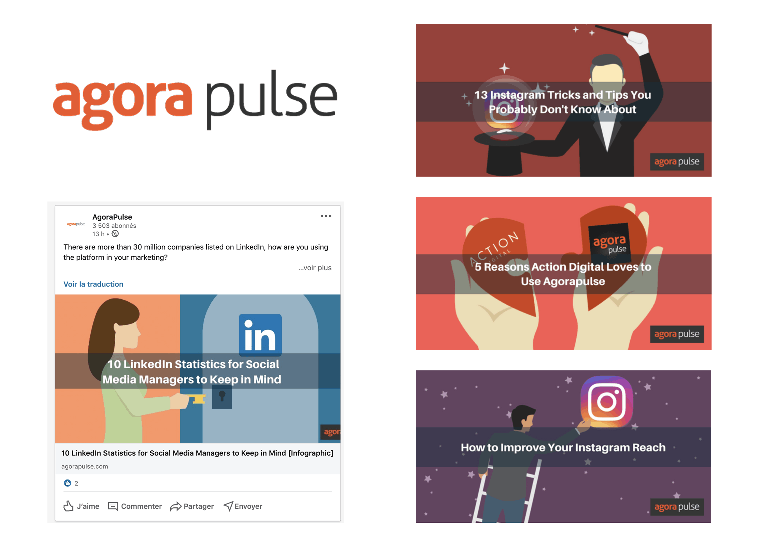
Going from this...
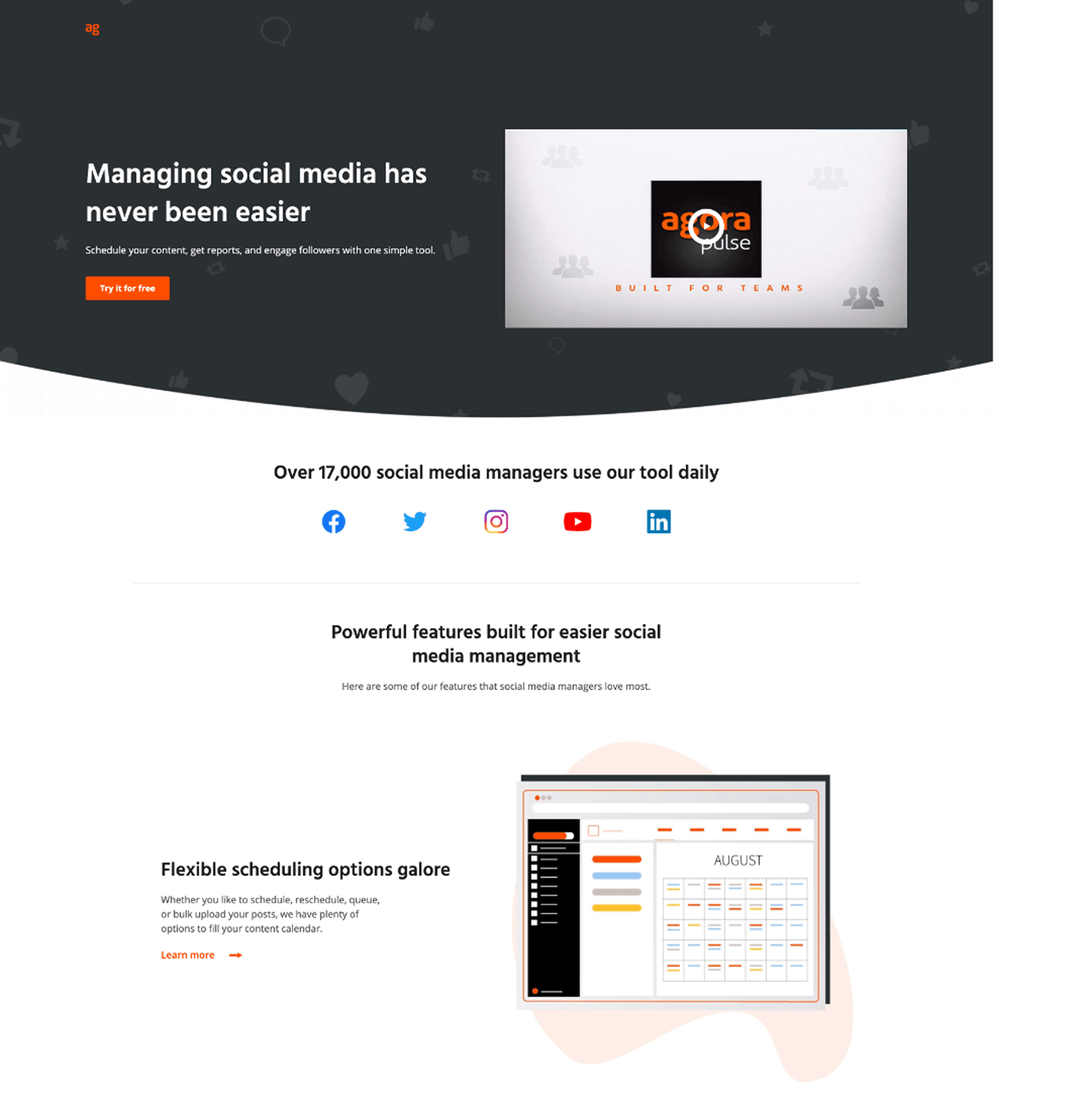
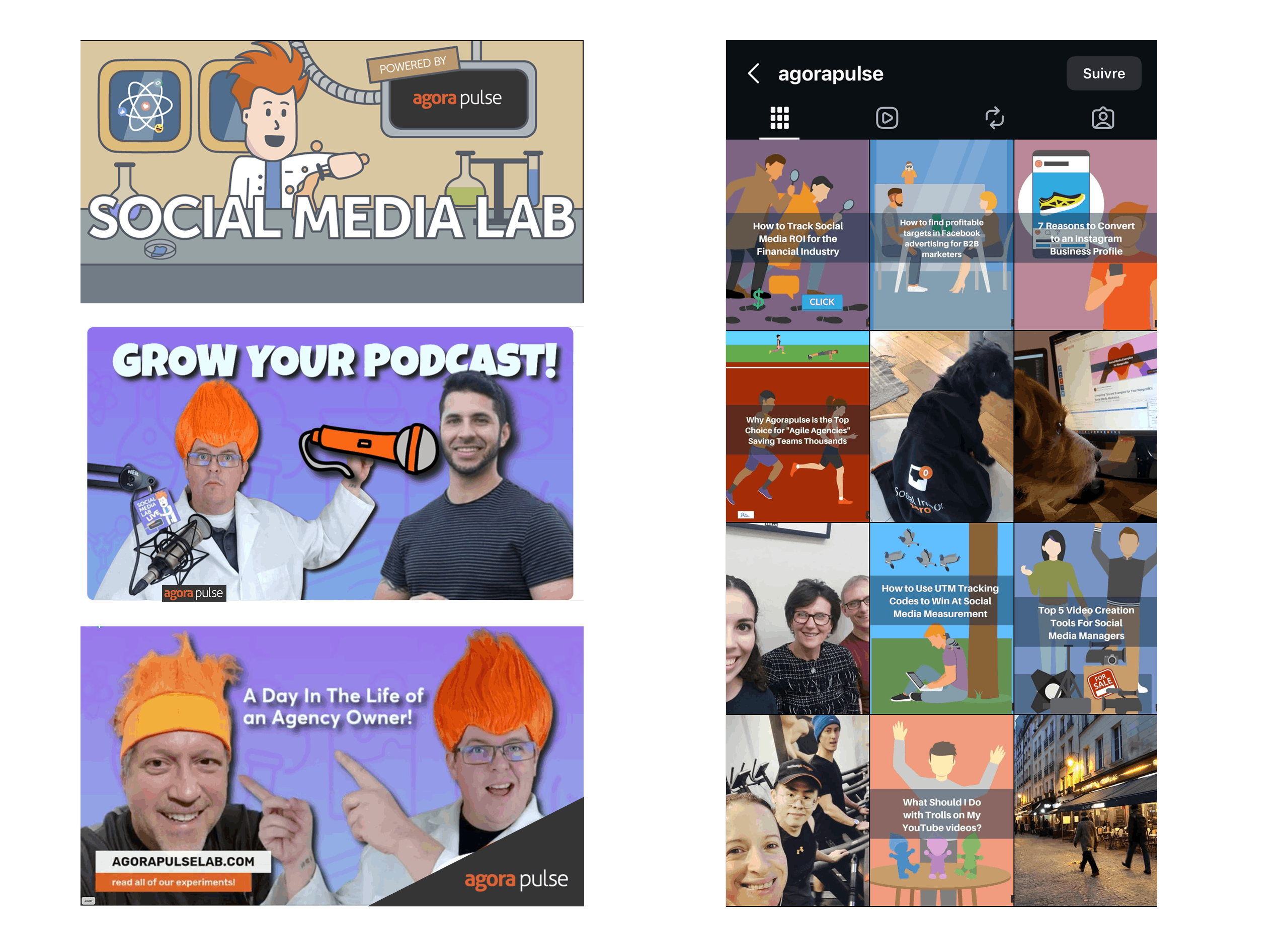
...to this


No time to read the whole case study? No worries.
The numbers that matter
+214%
Subscriptions in 2 months
2
Awwwards
(Mobile Excellence + Honors)
200+
Brand assets redesigned
4
Channels unified
(Web, Social, Product, Marketing)
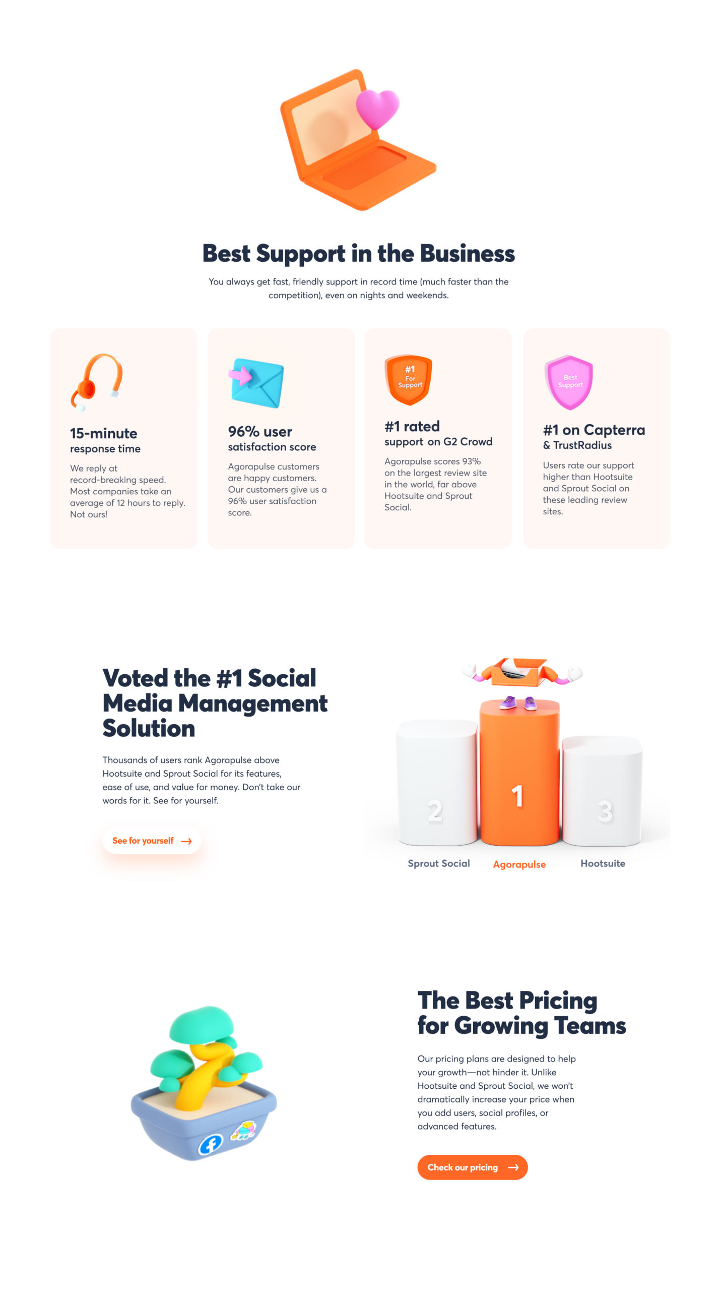
The context
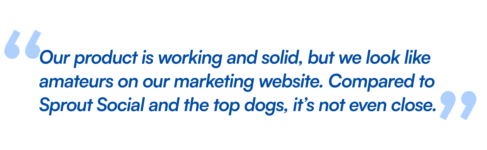
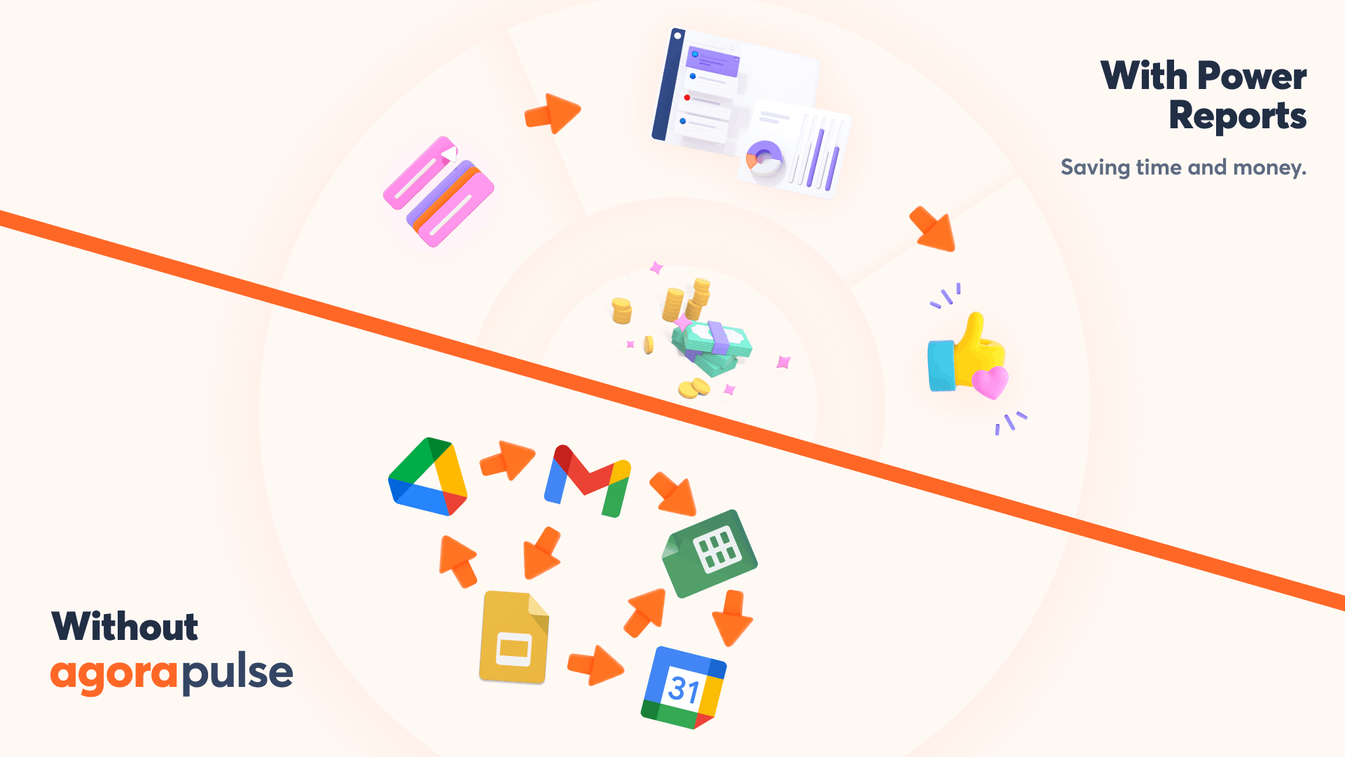
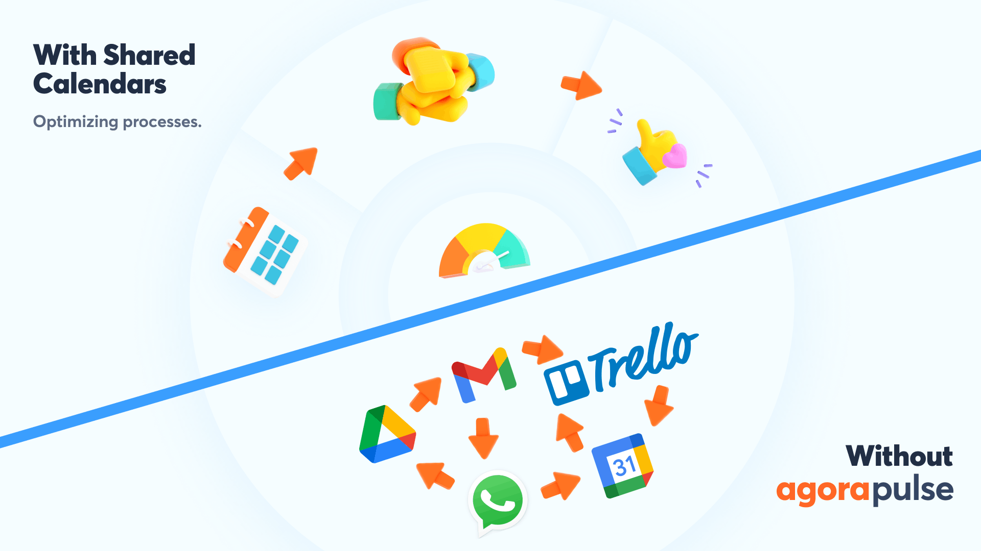
Agorapulse had a product that worked. The brand didn't match it.
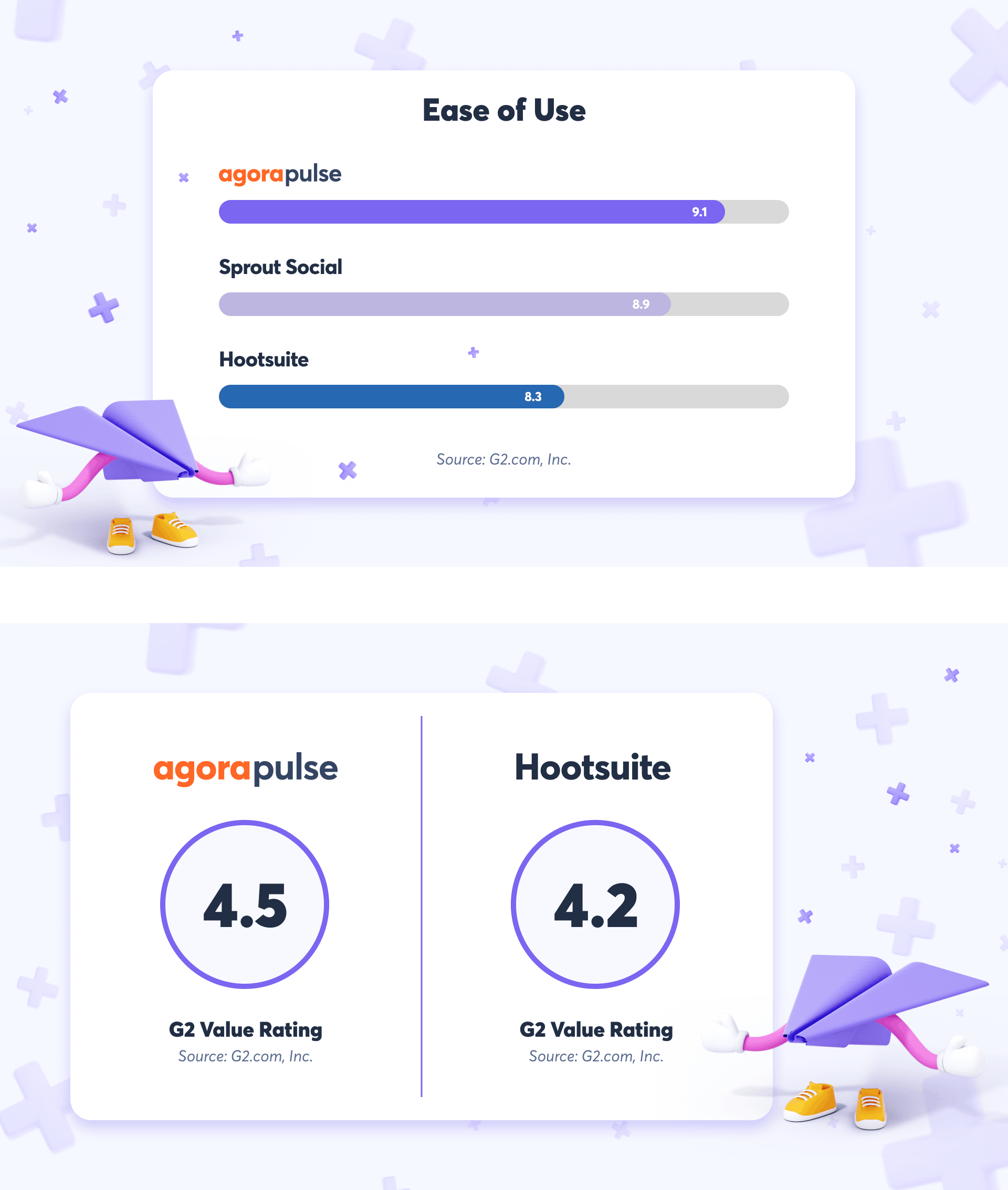
Competing against Hootsuite, Sprout Social and Buffer, the platform looked like a side project. Generic visuals, no identity, no coherence between product, website and marketing. A tool people used but never remembered.
Mission: rebuild everything. Logo, identity, 3D visual language.
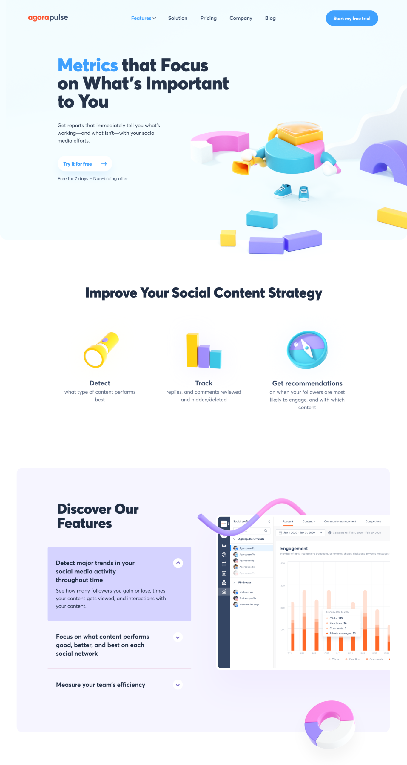
A closer look: the characters
Agorapulse has four core features. I turned each one into a character: friendly, memorable, and instantly recognizable. From sketch to 3D, each one went through storyboarding, shape research, animation blocking, and multiple rendering rounds.


Going from this...


...to this
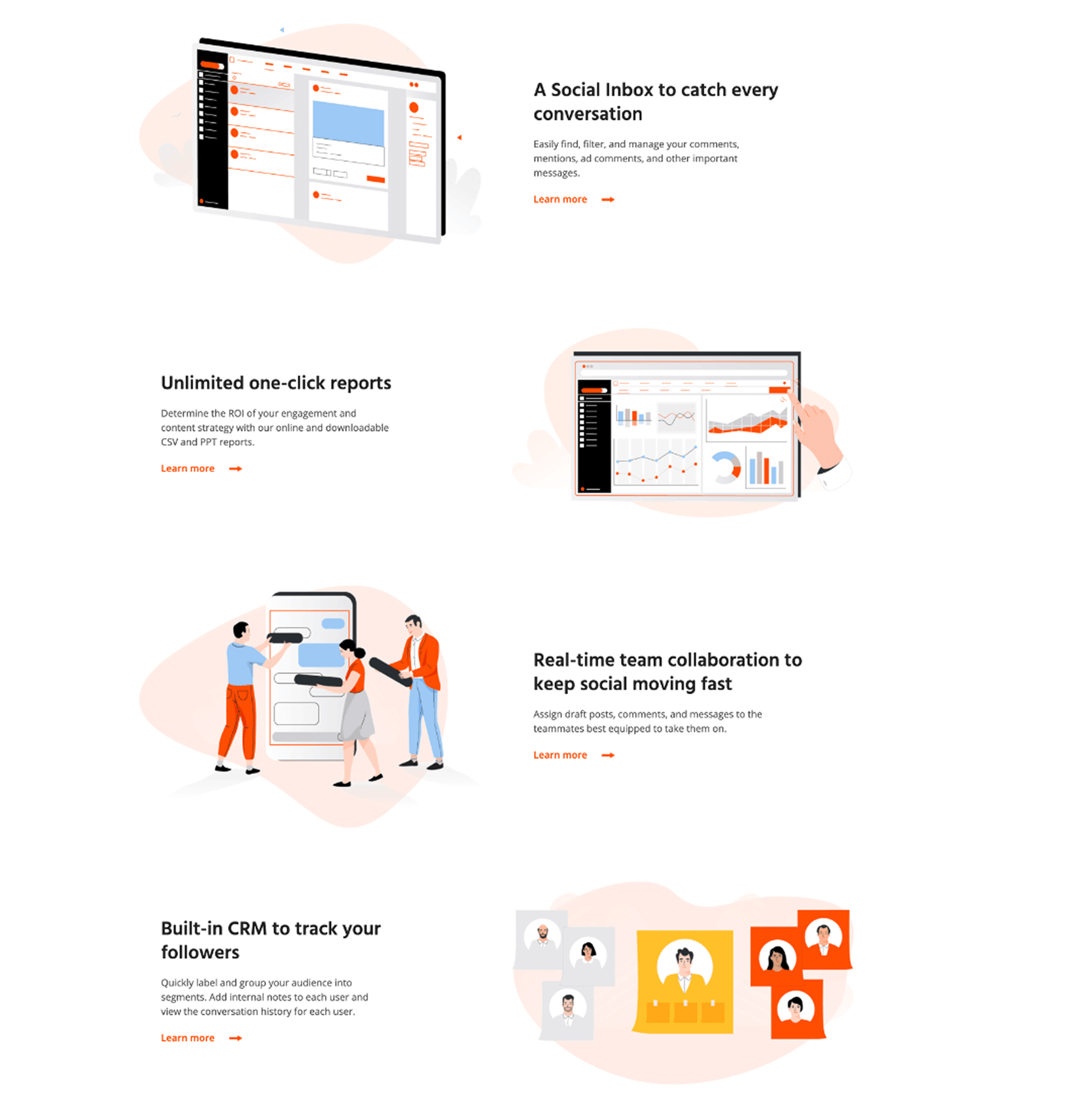
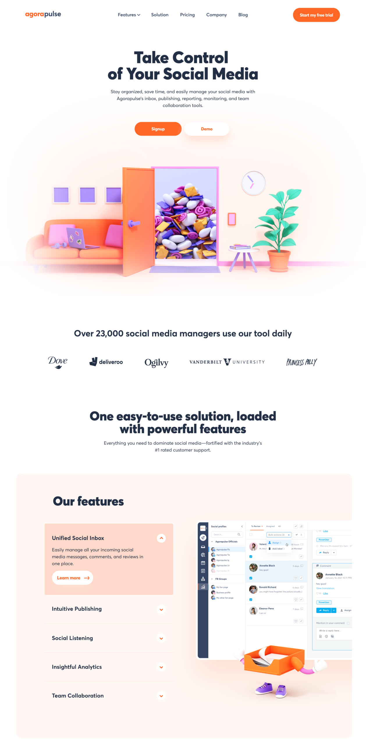
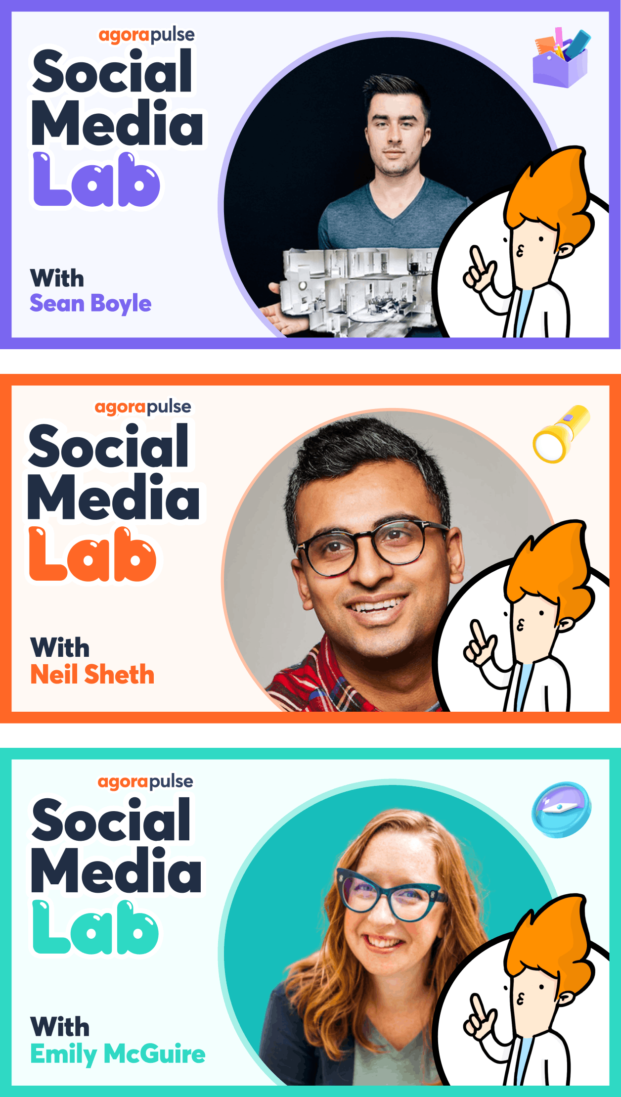
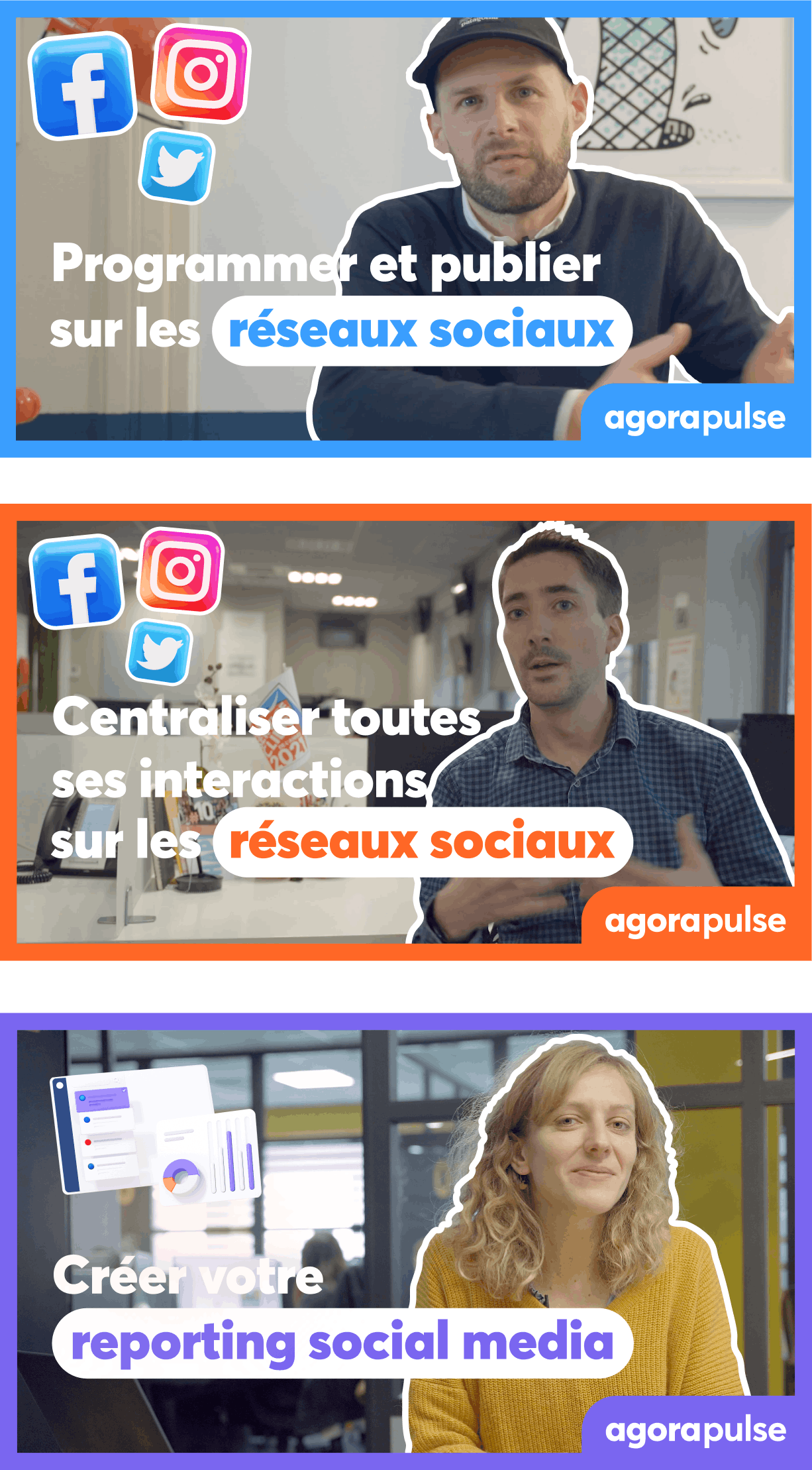
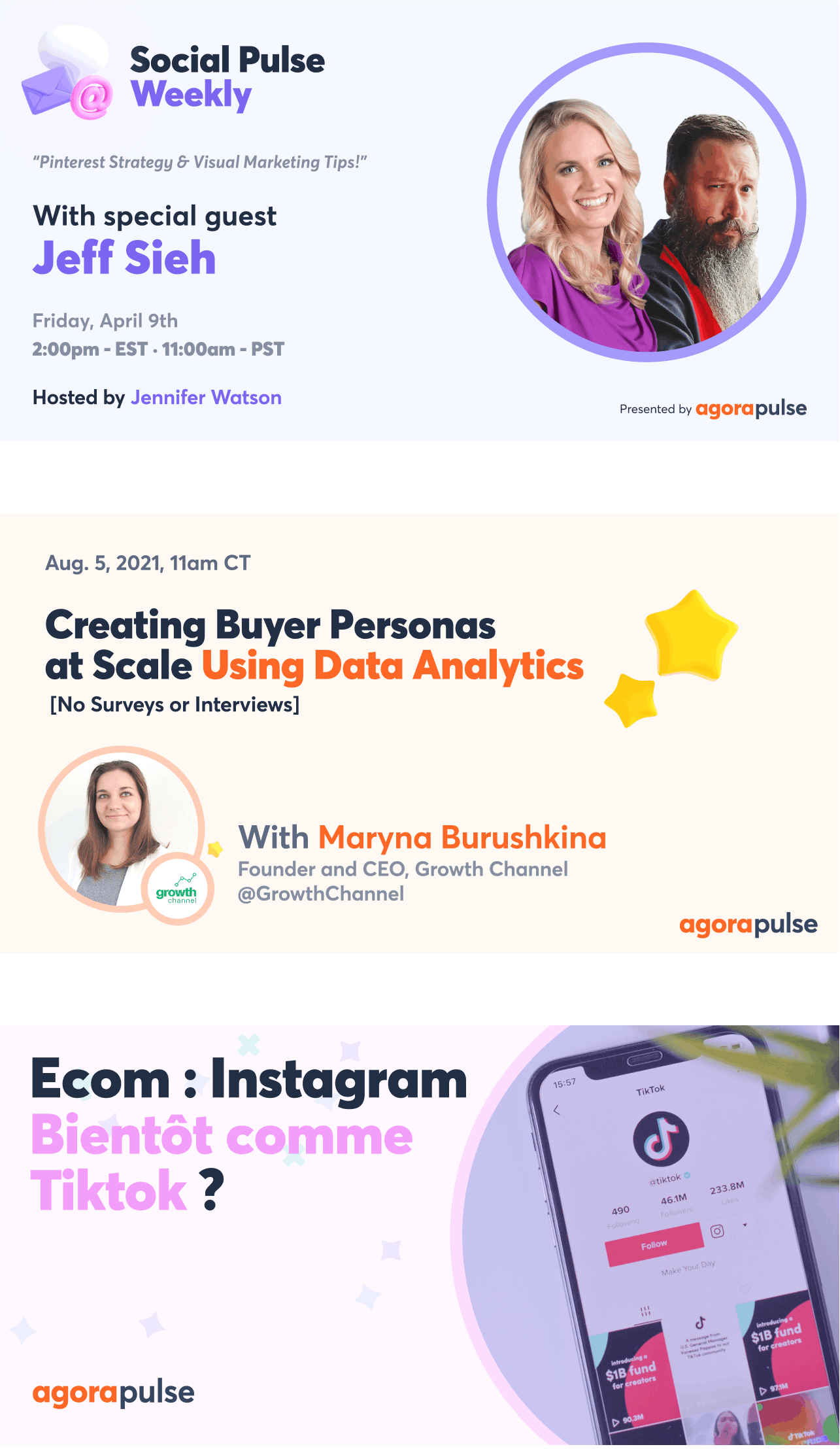
A closer look: the system
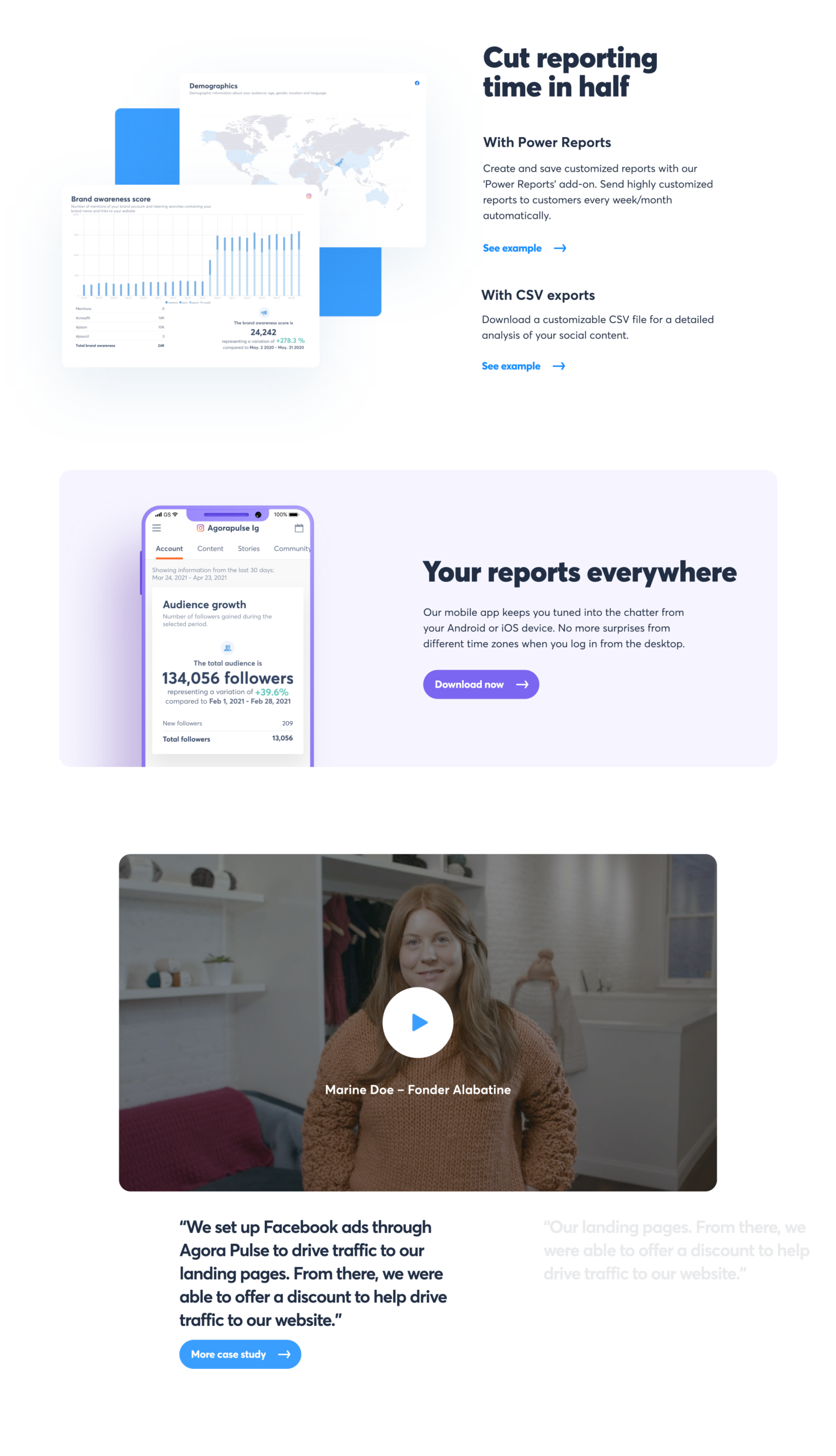
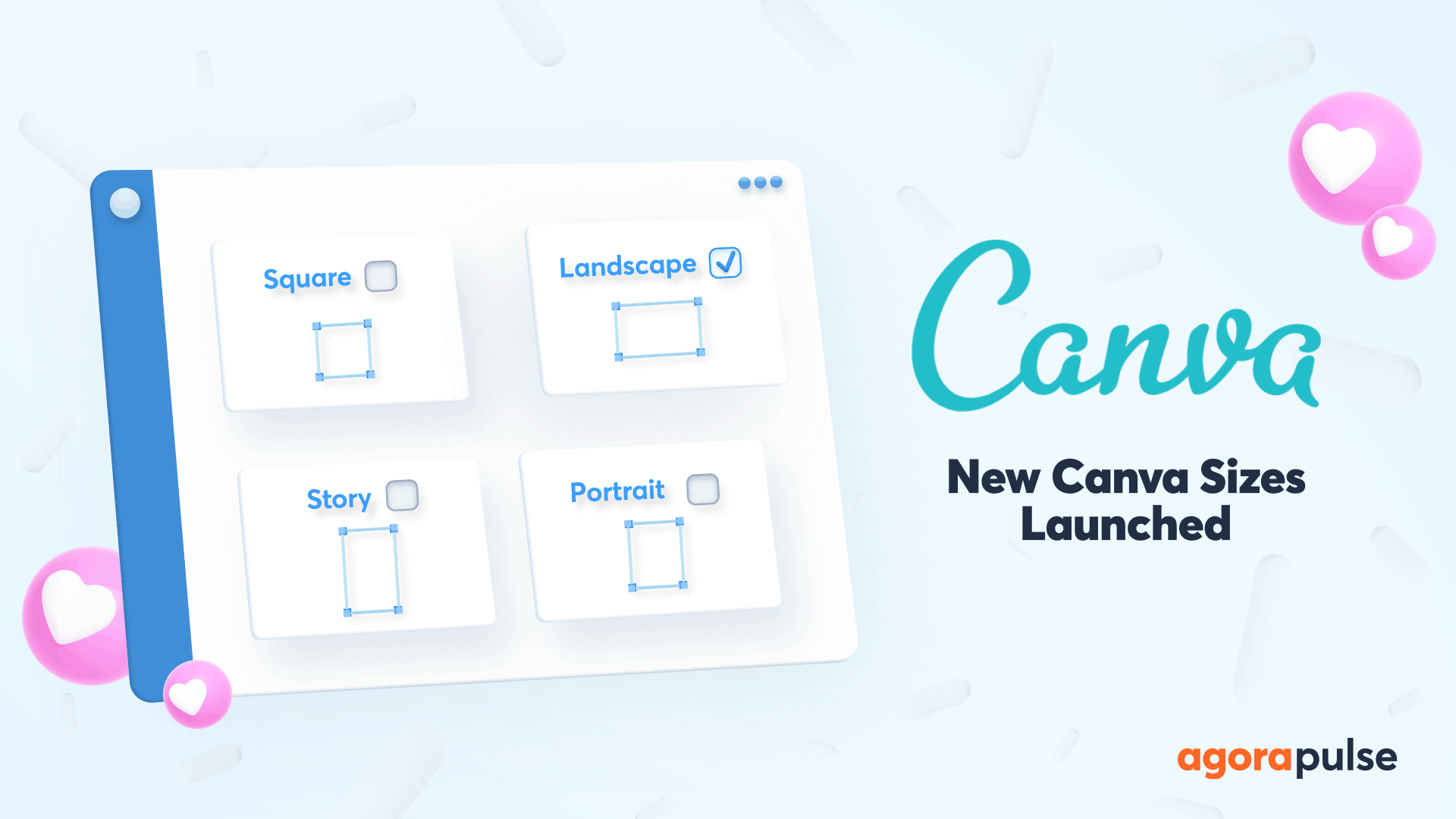
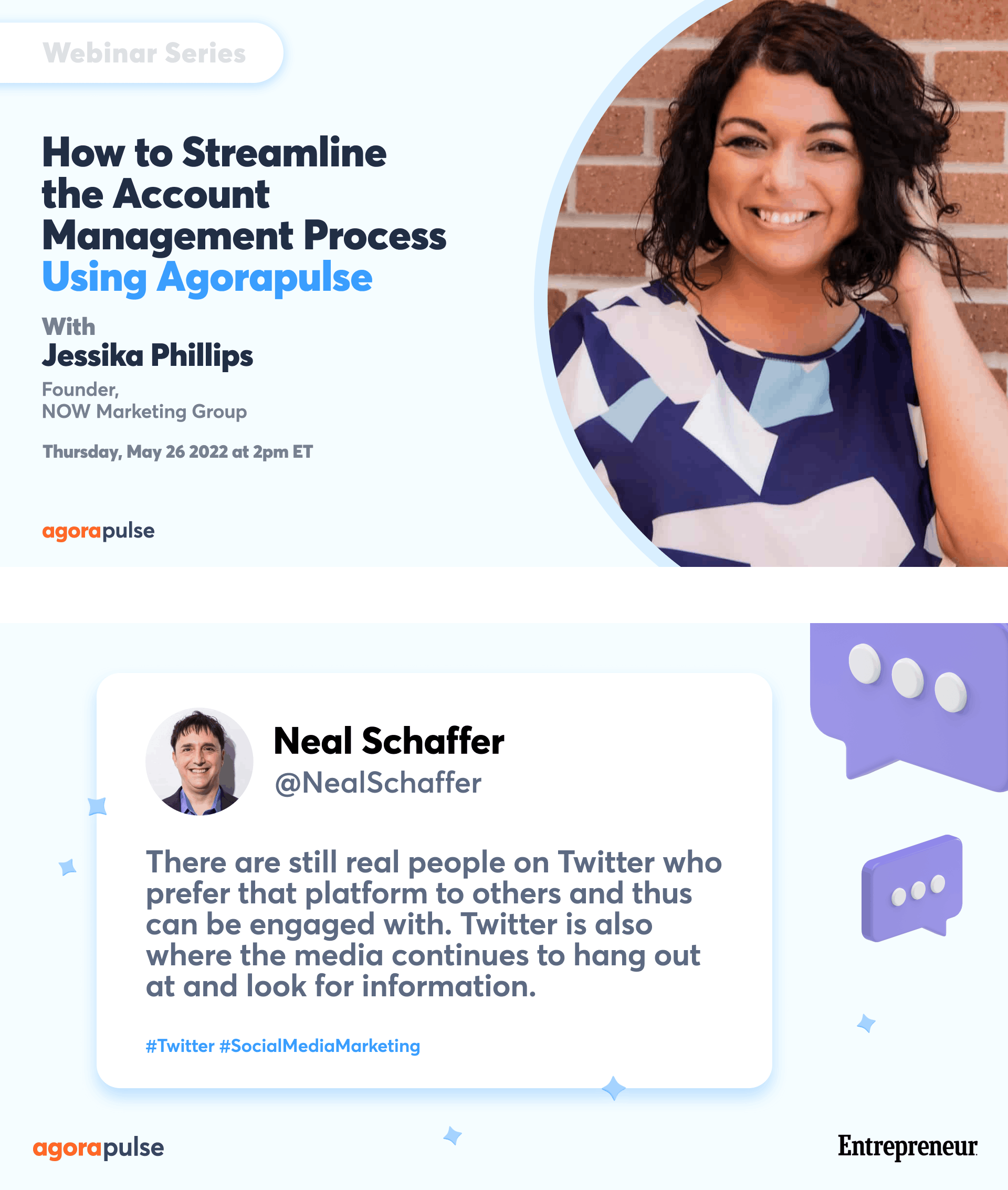
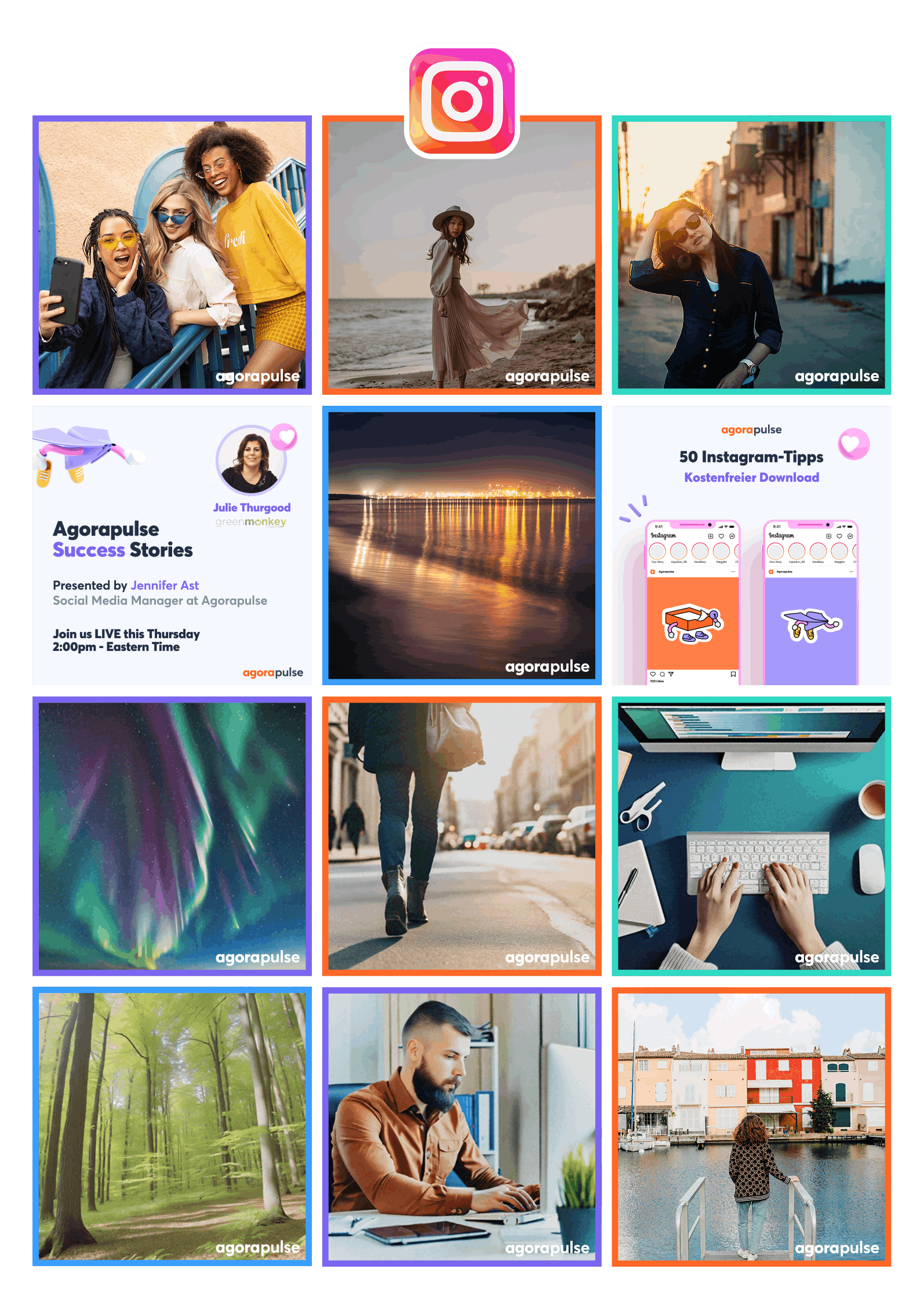
Characters were just the beginning. Every single brand touchpoint was redesigned: from scratch, alone. Social templates, podcast covers, YouTube thumbnails, every logo, webinar graphics, instagram grid visual direction, email visuals, ads, product loaders, presentation decks, internal assets. 200+ pieces, one coherent identity.


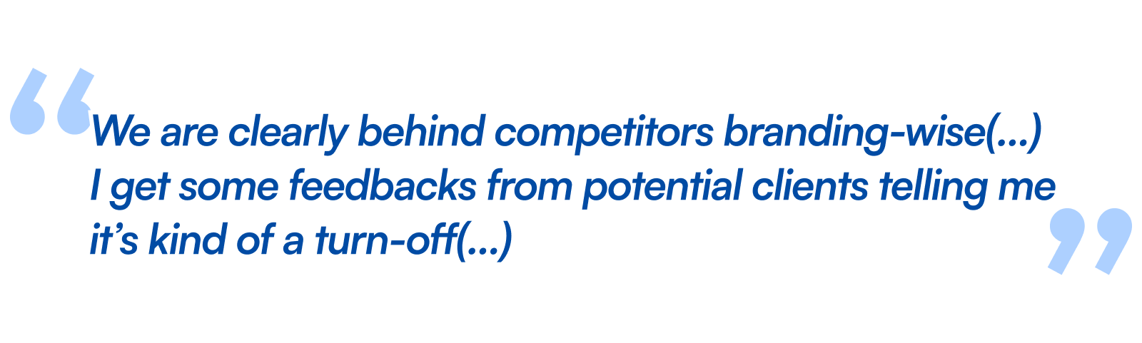
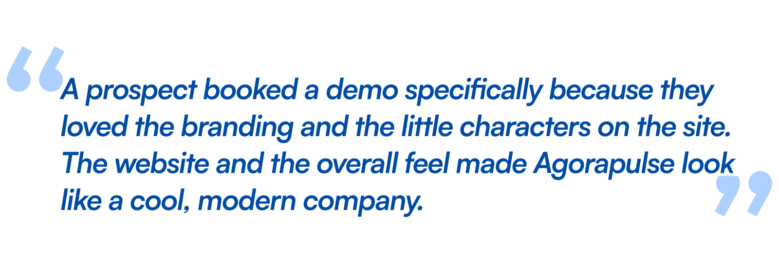
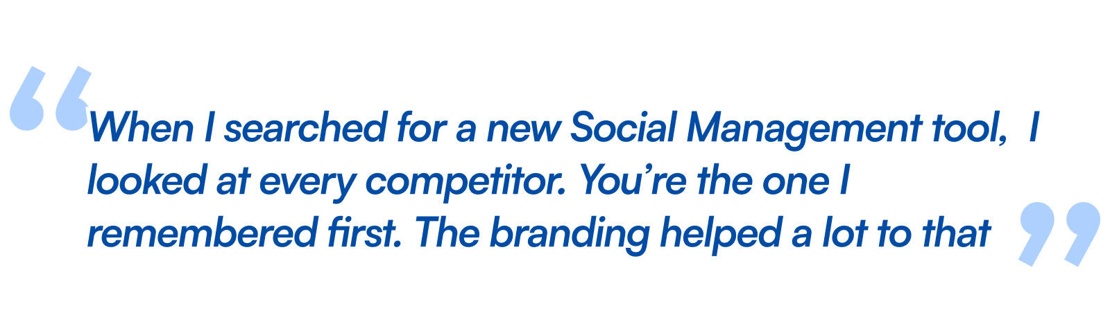
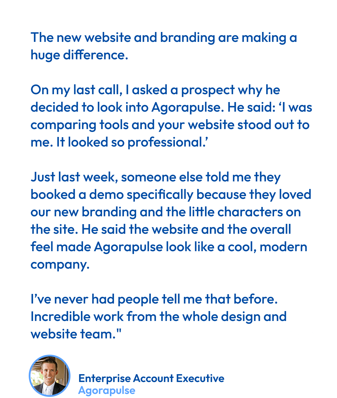
What they said about my work

Want to have a chat?
Made with love and care by Lucas Lengagne, 2026©
(Psst! Wanna know a secret ? I also create underwater films)