
UX
UI
DESIGN SYSTEM
READING TIME: 6 MINS
From zero to hero
Redesigning a Social Media Management tool from A to Z, making it one of the most awarded SaaS in its field. Deal? Deal.
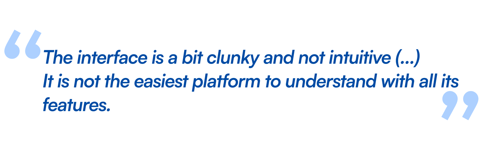
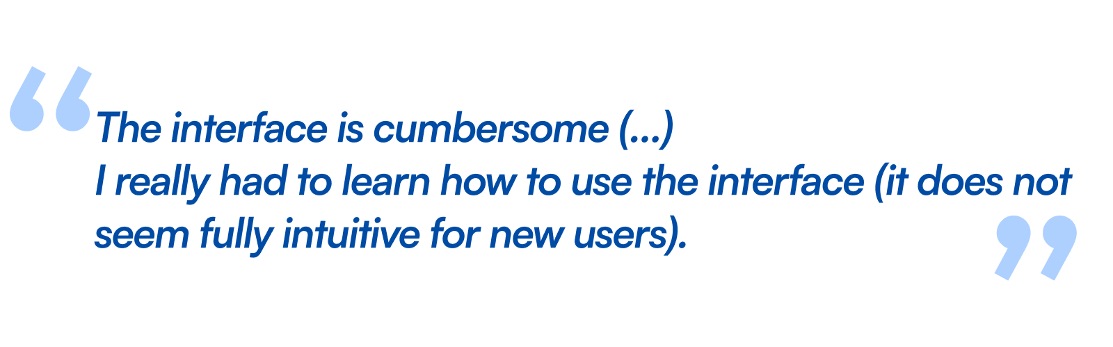
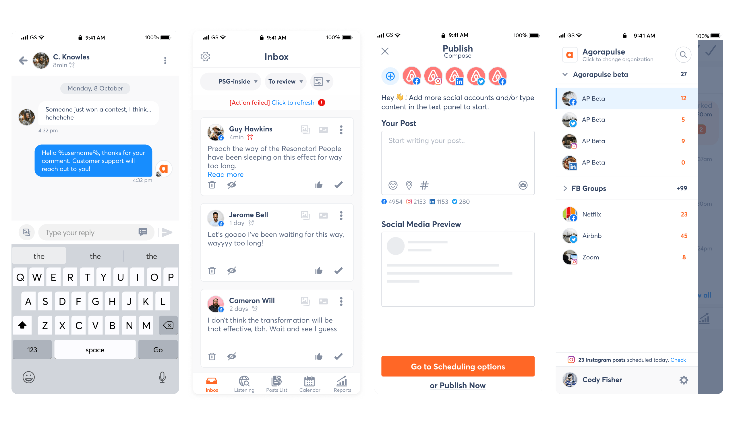
Going from this...
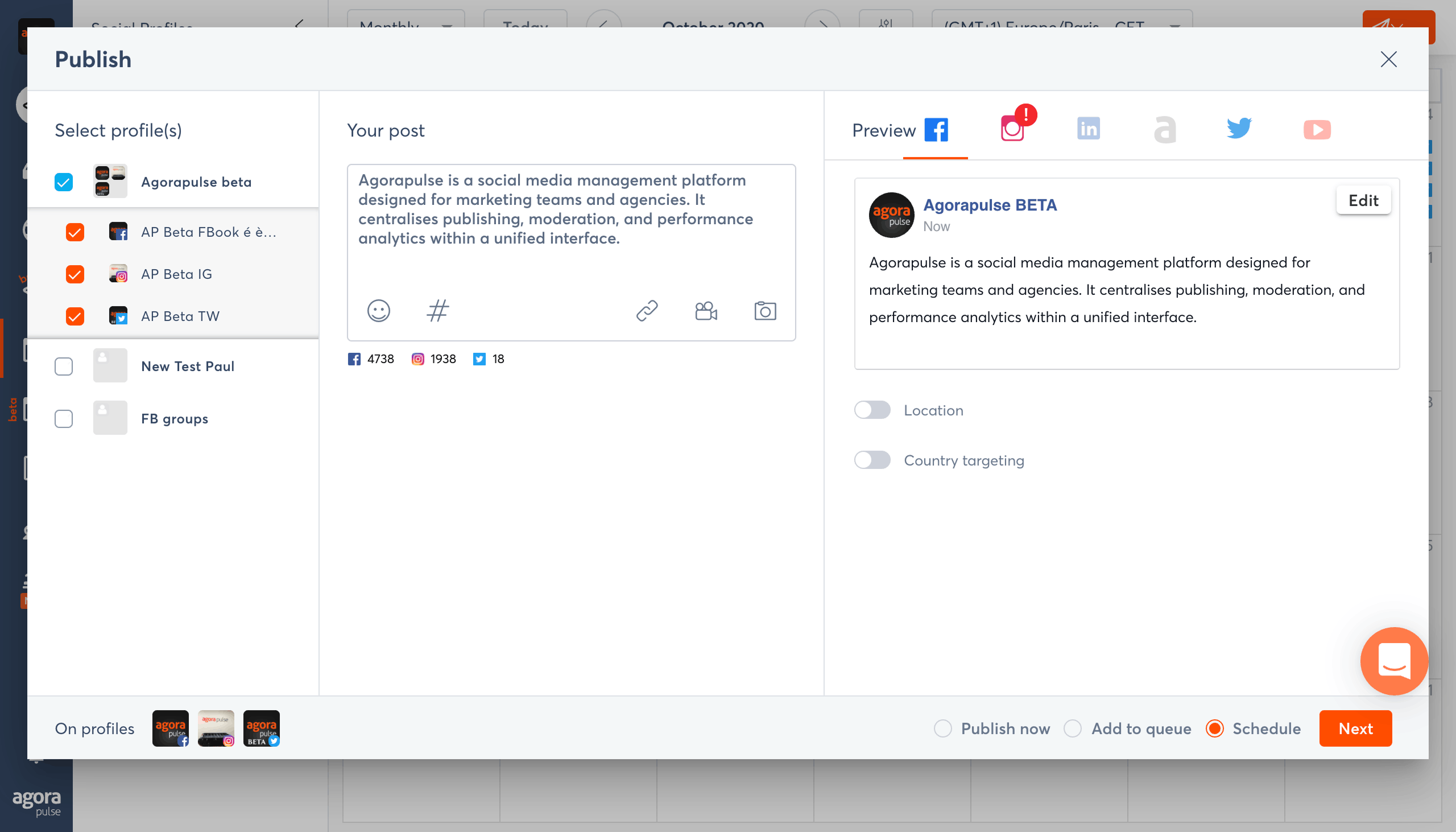
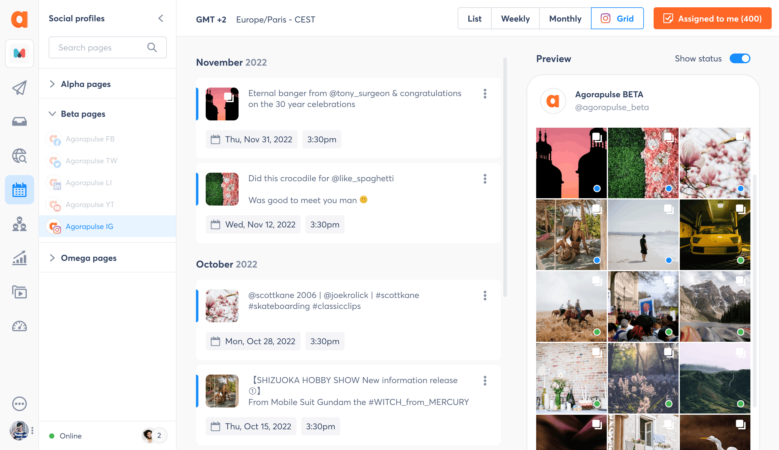
...to this

Source : G2 User reviews
No time to read the whole case study? No worries.
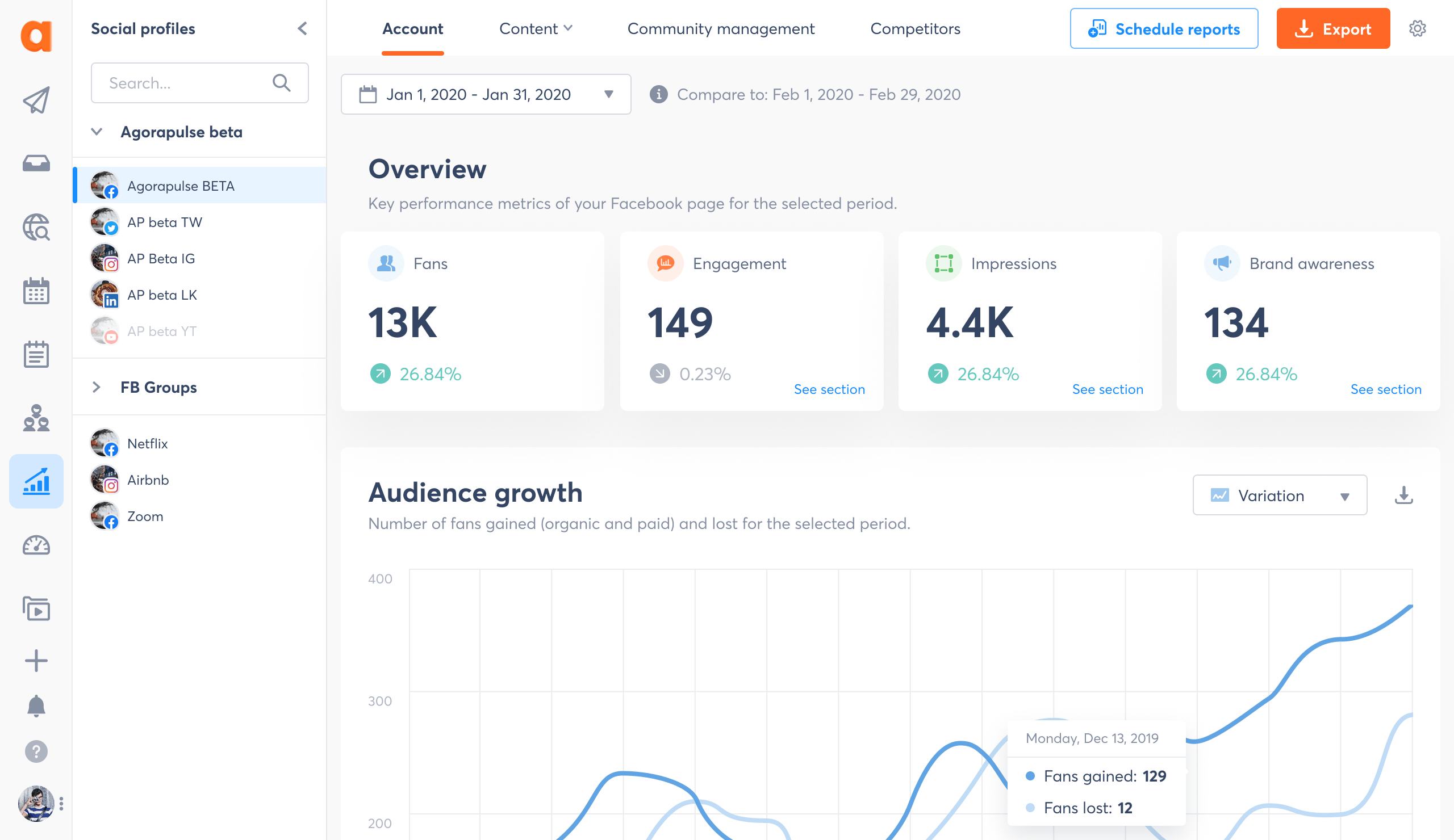
The numbers that matter
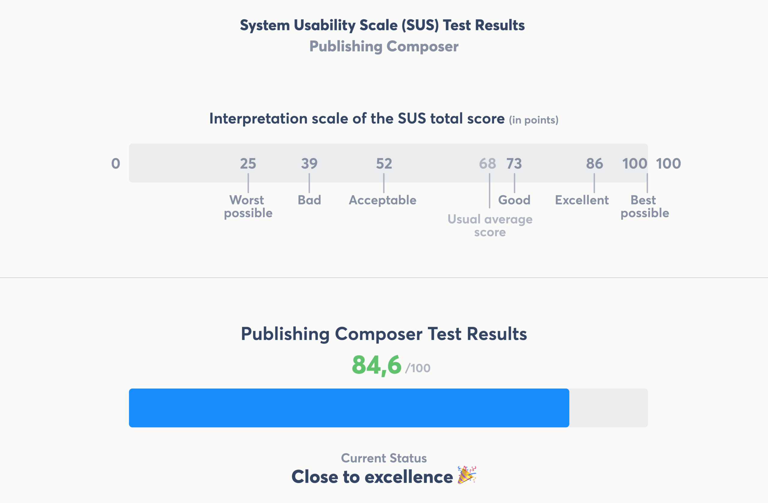
83,8
SUS Score (close to excellence)
35k
Users in 180 countries
4,5/5
G2 Rating
1
Design System from scratch
The context
Agorapulse is a Social Media Management platform used by 35,000+ professionals across 11,000+ businesses in 180+ countries.
Publishing, inbox, reporting, monitoring, all in one tool.
Before I arrived, the web + mobile app had been only built by engineers. It did the job, but it was seriously lacking UX effectiveness across all features, a unified experience between them, and a clean, modern UI.
I was tasked to revamp everything. Rethink every feature in terms of UX, push a new UI, establish a unified experience across all features, build the design system, and rebrand the entire company.
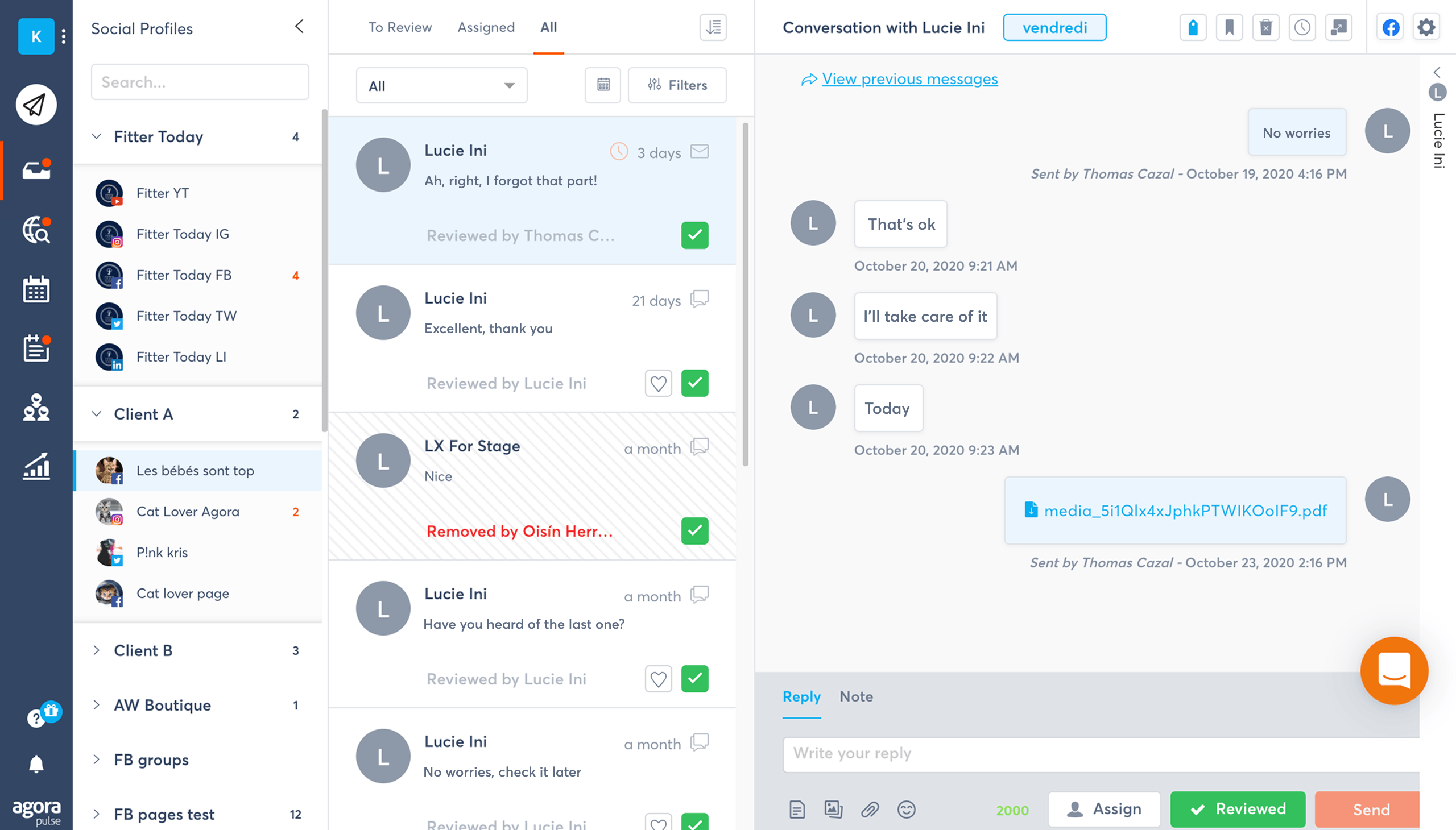
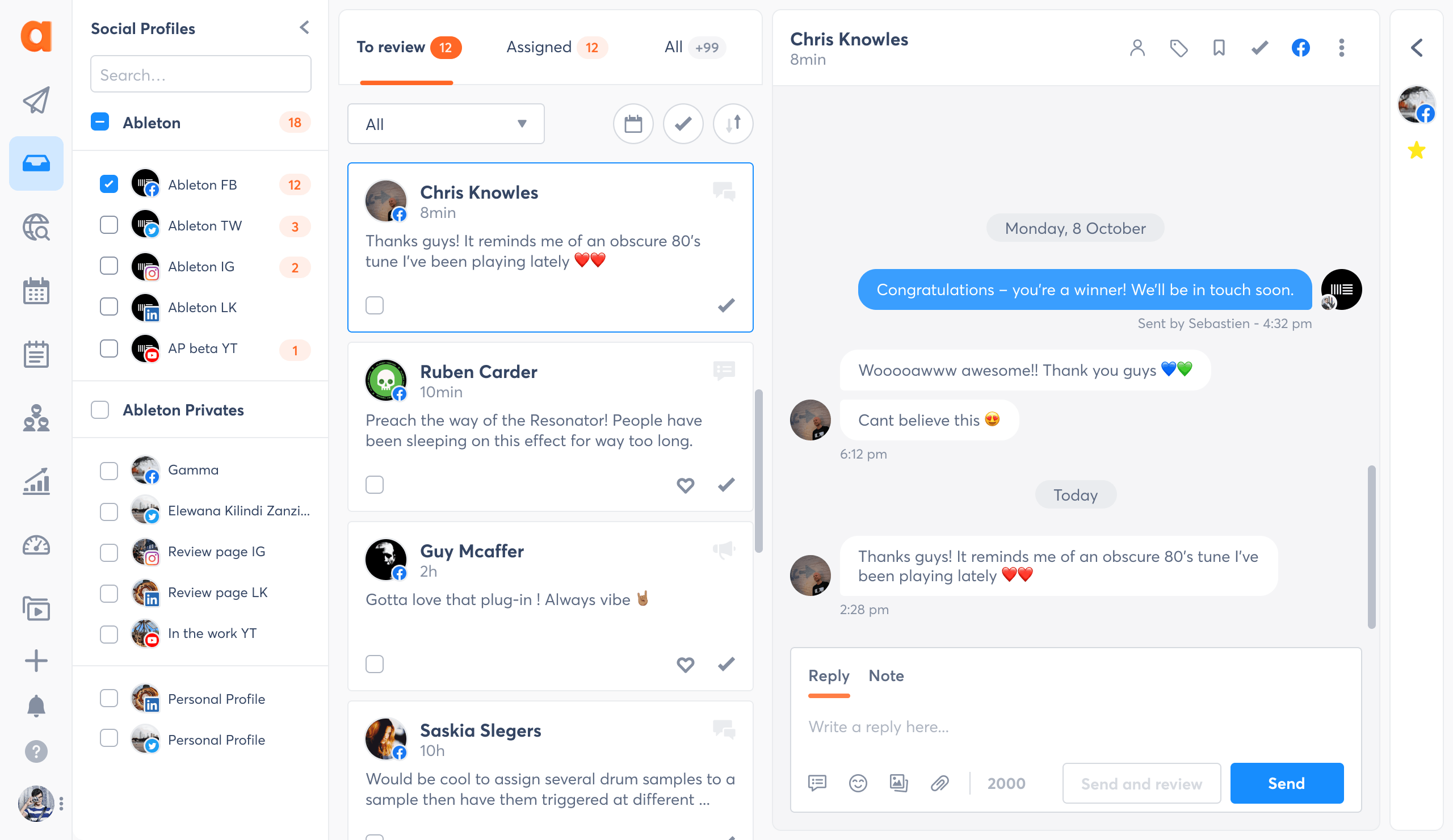
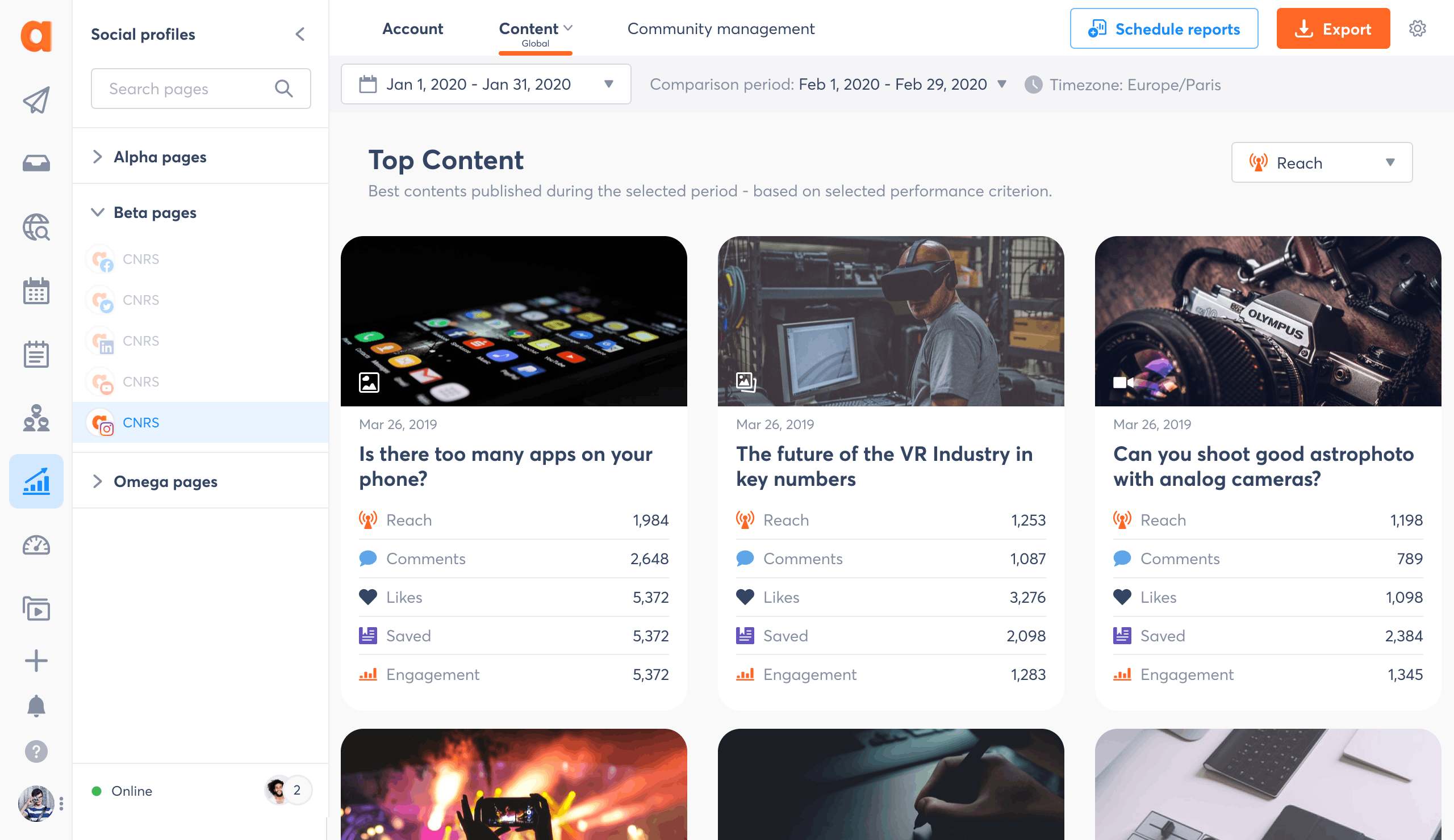
A closer look: the Publishing Composer
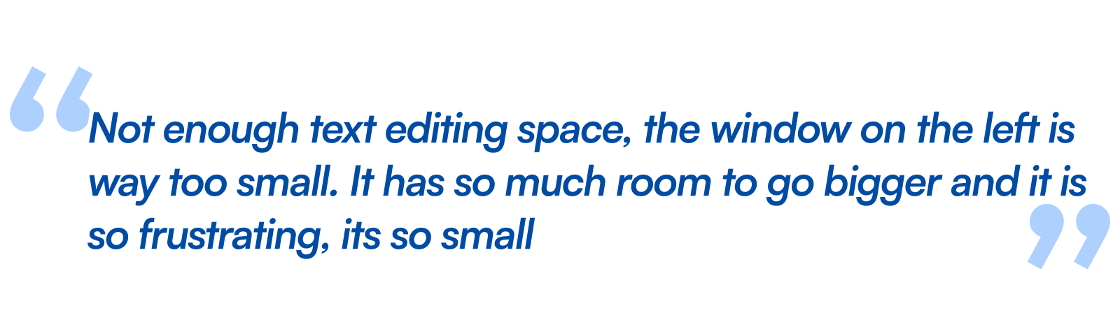
The Composer was the most used and most criticized feature. Users had to create their post in a cramped modal, then jump to a separate screen to schedule it. No preview of what the post would actually look like. Two steps for one action.
Going from this...
...to this
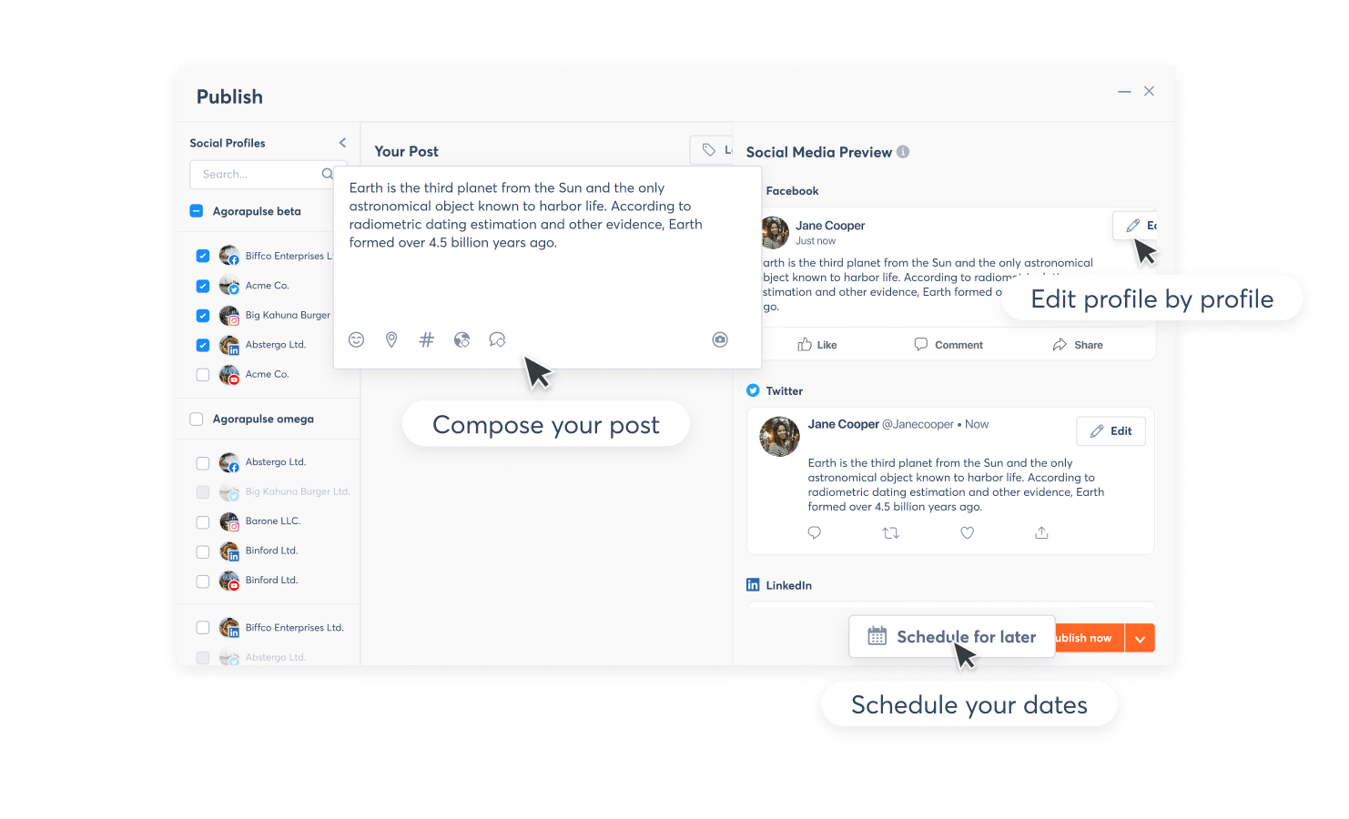
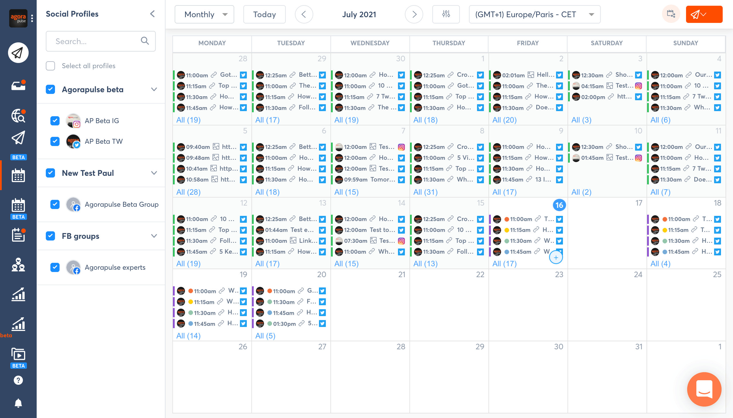
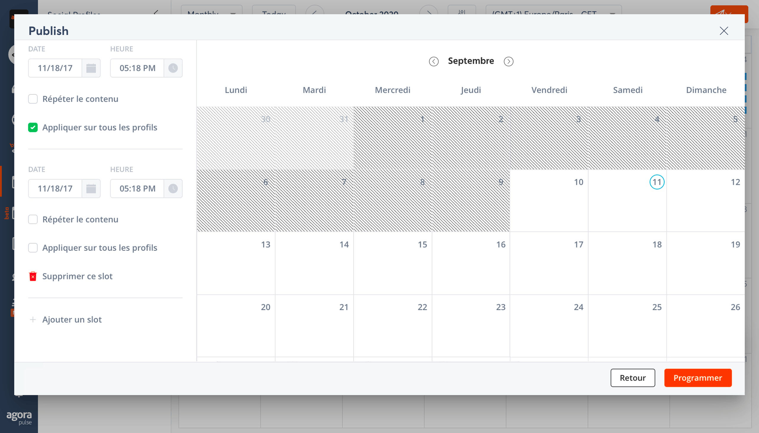
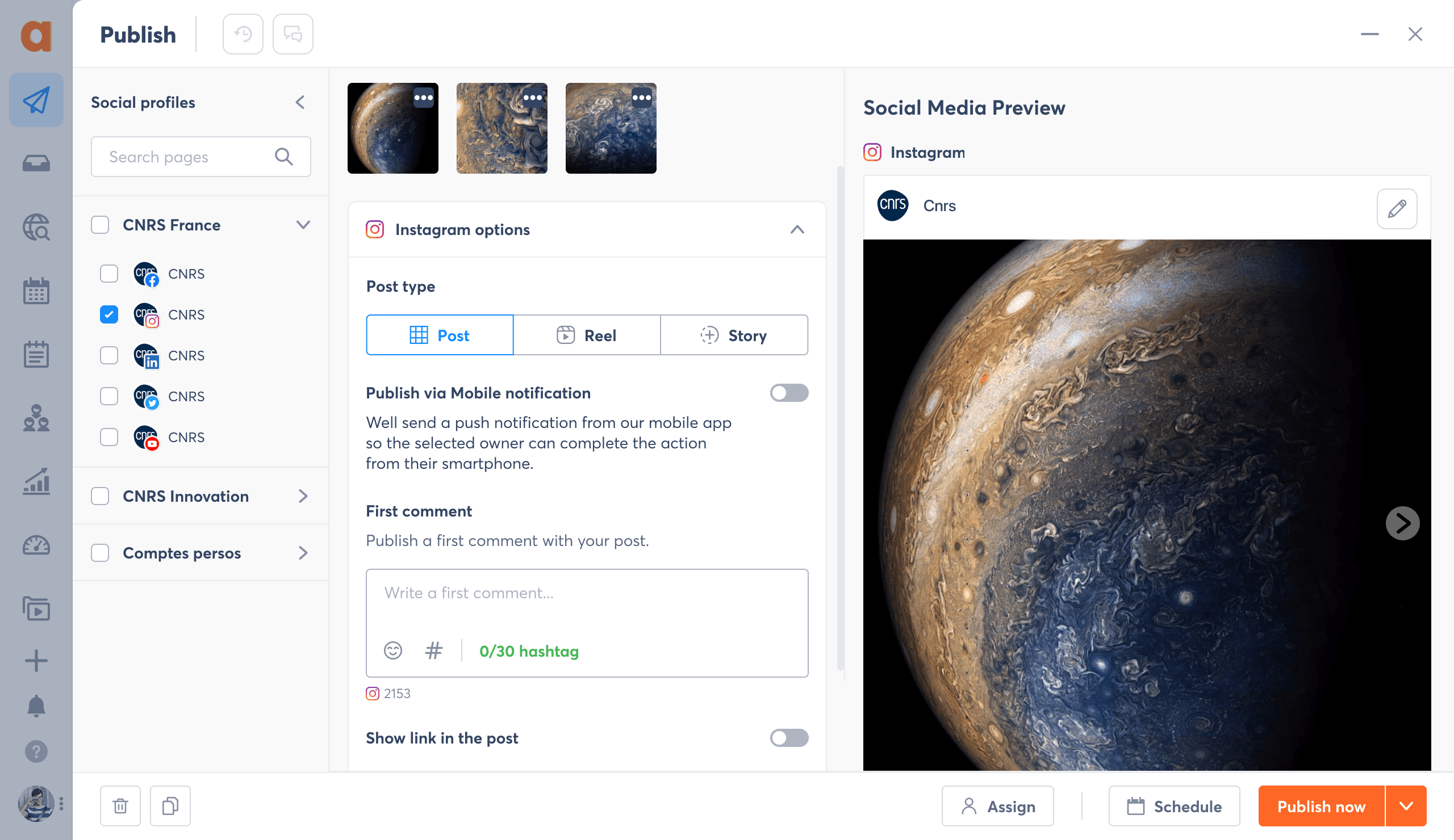
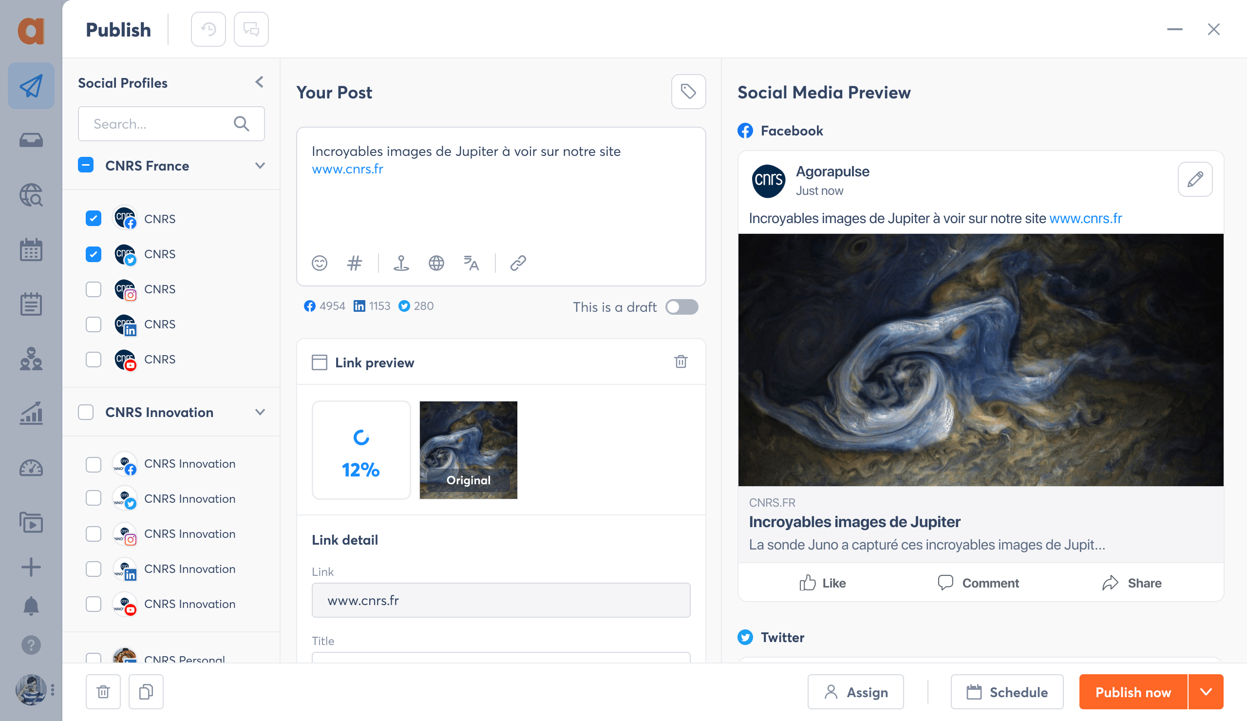
Create, preview and schedule in one screen
Merged a 2-step flow into one. Users no longer lose context between composing and scheduling.
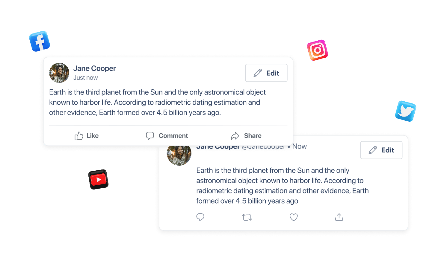
Posts preview finally look like real Social Media posts
No more guessing. Built pixel-accurate previews for each social network.
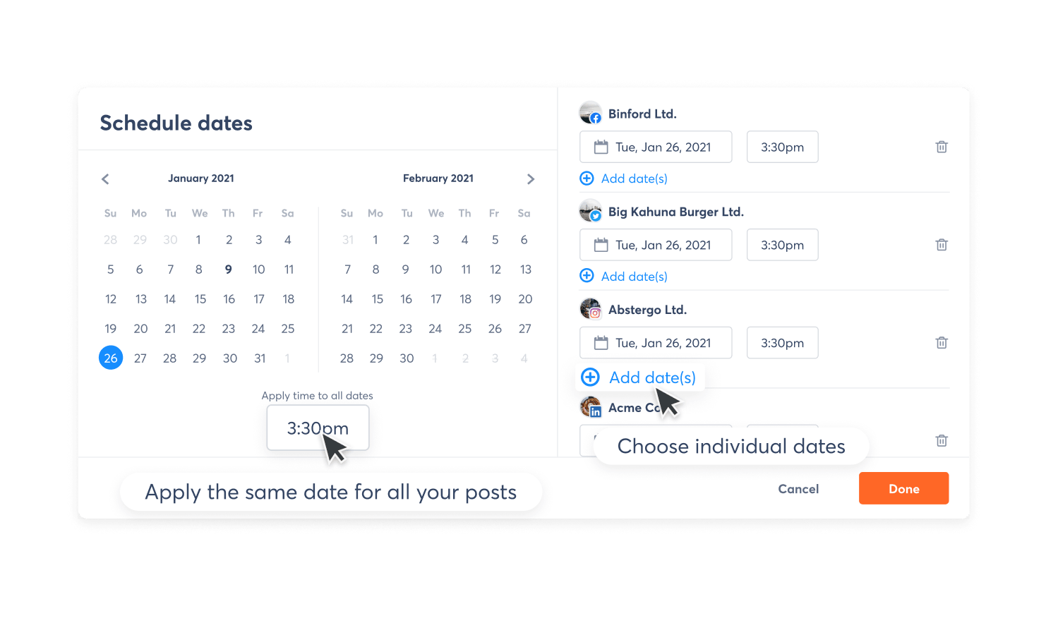
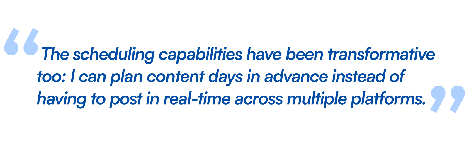
Schedule smarter and faster
Same date for all posts, or customized dates and times for each social profile. One action instead of repeating it for every account.
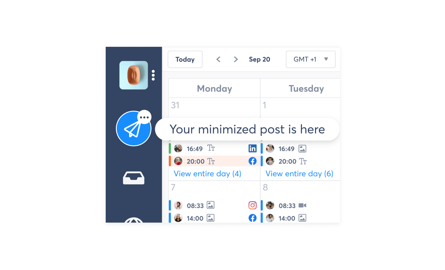
Minimize the Composer
Users finally can multitask ; Start to write a post, then check the calendar or inbox, and come back. No lost work, no blocked workflow.
Source : G2 User reviews
Validated with 52 users through A/B testing. The results:
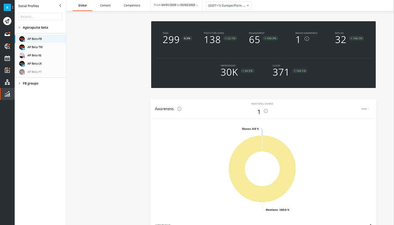
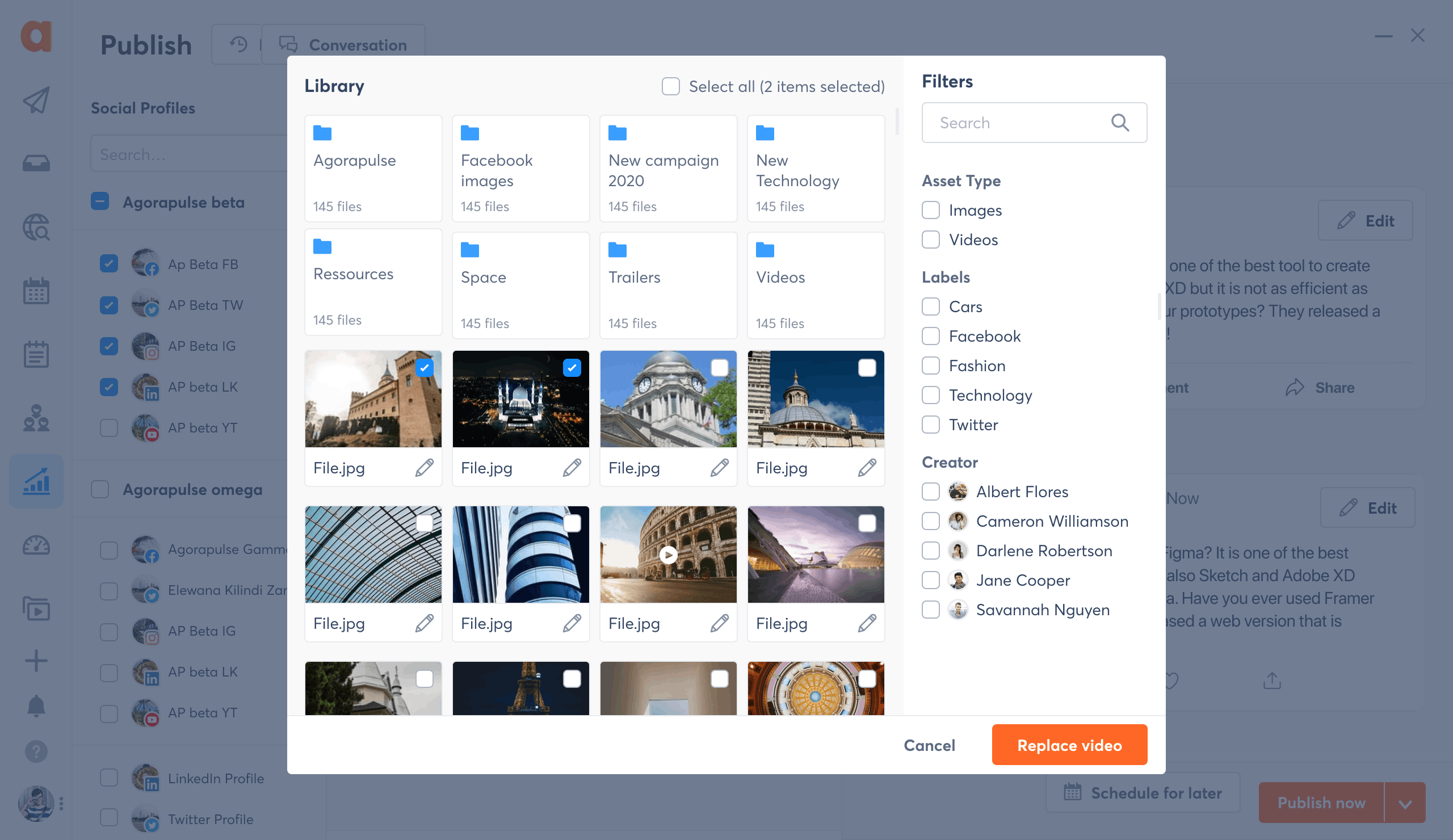
The Design System
One Design System covering web, mobile, and brand guidelines. Built from scratch, documented, and adopted by all teams. Still in use today.


The recognition
After the revamp, Agorapulse became one of the most awarded Social Media Management tools on the market. Got the job done!


Voted by users on G2, from 2020 to 2025
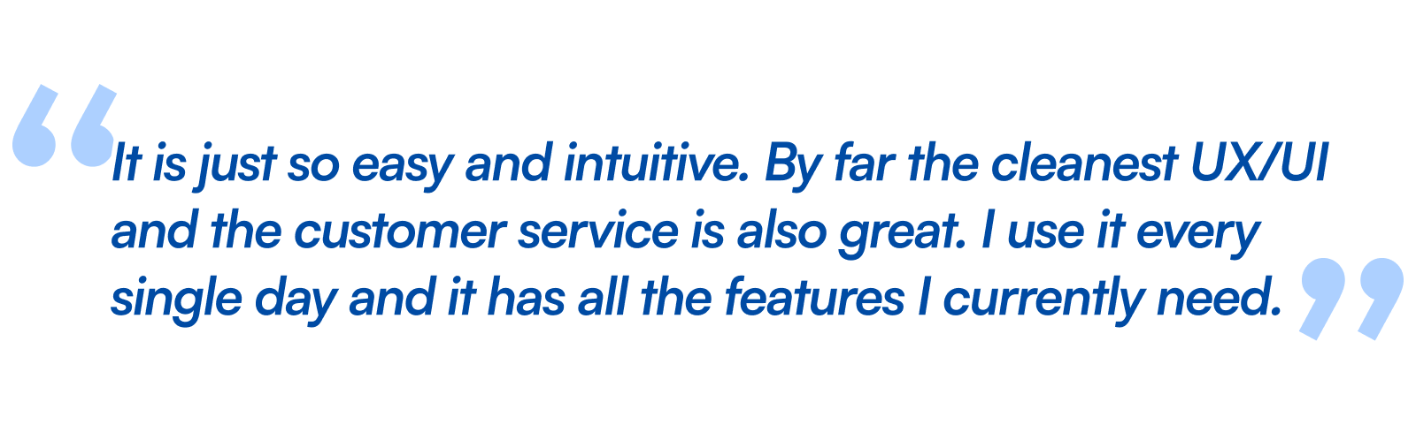
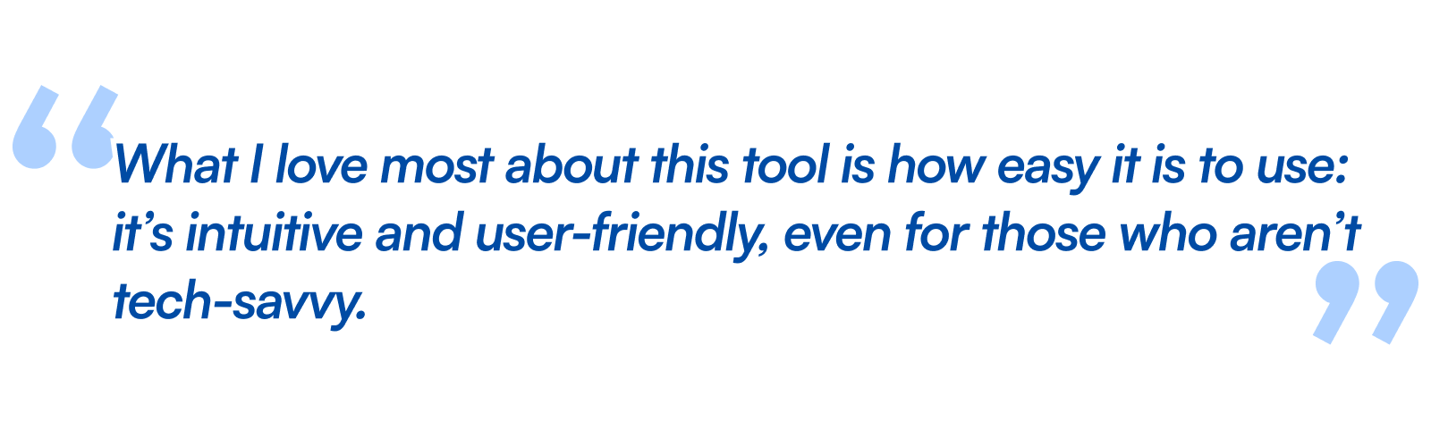
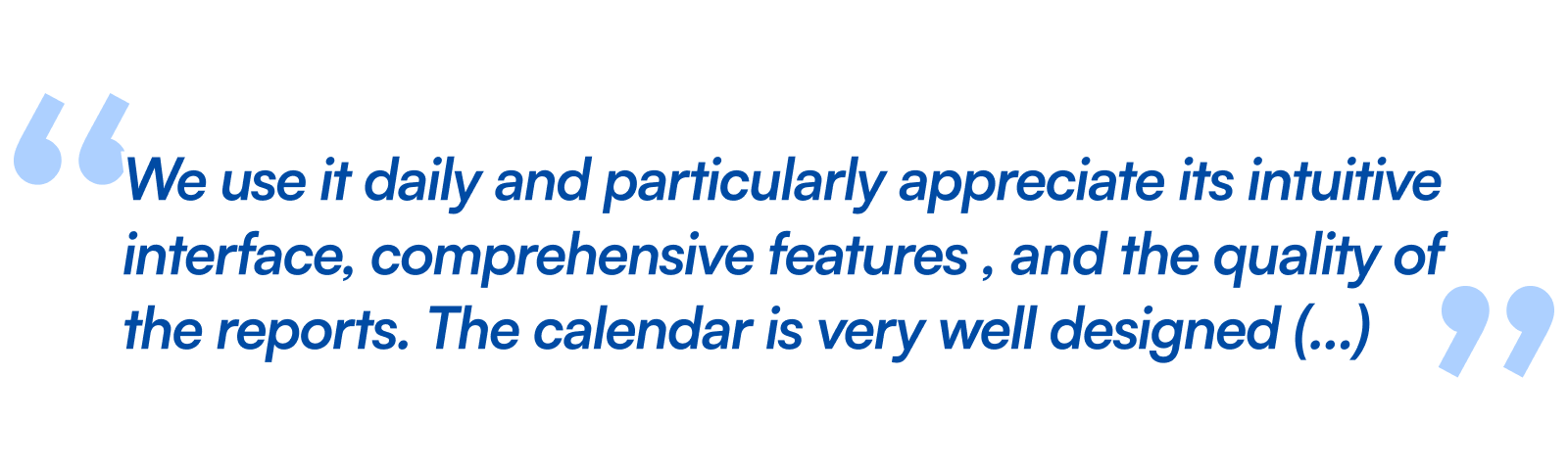
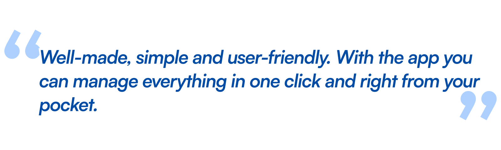
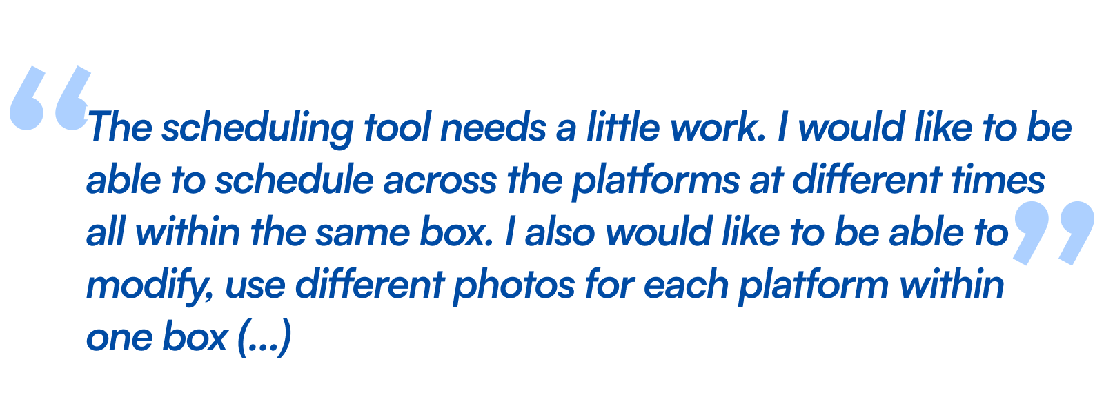
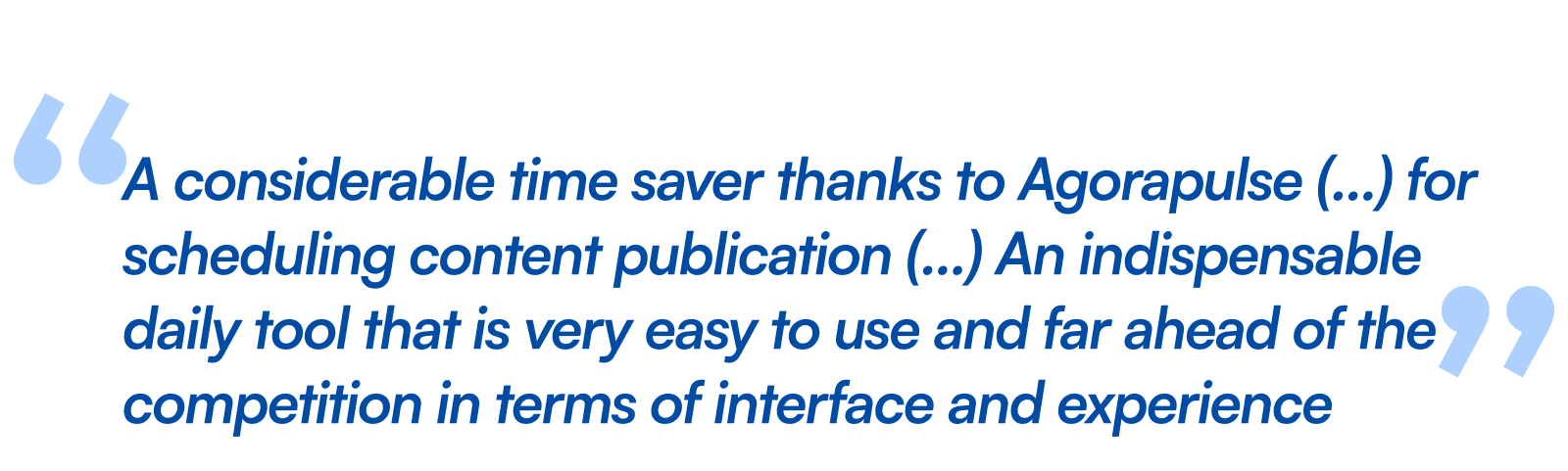
What they said about my work


Want to have a chat?
Made with love and care by Lucas Lengagne, 2026©
(Psst! Wanna know a secret ? I also create underwater films)